Pirita beach pavilion, photographer Rein Vainküla
Pirita beach pavilion
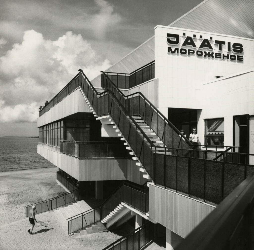
Photographer Rein Vainküla of State Design Office Tsentrosojuzprojekt has captured the photogenic central element of the Pirita beach pavilion with its dining establishments, in which the combination of architectural parts provides an impressive melange. The shot, built on contrasting tones and diagonal lines, creates a somewhat deceptive, even constructivist impression. A human scale is added to the photograph by the beach-goers that seem to be almost strategically positioned.
Planning the new Pirita beach pavilion was instigated for the sailing regatta that took place in Tallinn as part of the 1980 Moscow Olympics. To make way for the new building, which was completed in 1979, a wooden beach pavilion designed by Edgar Kuusik and Franz de Vries and built in 1929, was demolished. At first, the new building, blindingly light and bright in the sun, had a restaurant, bar, cafeteria, three banquet halls, and in each wing rooms intended for beach-goers. The building was designed by Mai Roosna at Tsentrosojuzprojekt. At the beginning of the 2000s, the building was almost completely rebuilt to house apartments (architect Ülo Peil). Text: Jarmo Kauge
Voldemar Herkel, Mai Roosna, 1965. EAM MK 174
The passenger pavilion of the Port of Tallinn
The passenger pavilion in the Port of Tallinn was opened on July 7, 1965, when the travel connection between Tallinn and Helsinki, interrupted during the war, was restored. The pavilion, designed by architects Voldemar Herkel and Mai Roosna, reflected contemporary Finnish-influenced architecture. The walls of the pavilion were formed by shields with a load-bearing steel frame, which were filled with glass or partly with wood. The floor-to-ceiling glass walls of the building opened the view to the sea; wooden shields were used on walls where, based on the function of the rooms, more privacy was needed. In contrast to the wide white cornice of the horizontal roof, the building’s clapboards were covered with dark pine tar. Building ventilation and air heating pipes were placed inside the eaves, rainwater was drained from the corners of the roof. The unity of the interior and exterior of the pavilion was also important in the design. The suspended ceiling with strip lights used in the interior moved smoothly with the same rhythm over the ceiling of the canopy, the terraces of the building and the floors of the common rooms were covered with the same dolomite tiles. The partially landscaped courtyard in the middle of the building made the interior of the pavilion more spacious and added a little greenery to the harbour environment.There was a waiting room for international travelers in the seaside part of the pavilion, and a cafe-bar operated in the back of the room. A smaller waiting room in another side of the building was intended for passengers of local ship lines. In addition, there were offices, a currency exchange point and the foreign tourism office Inturist in the pavilion. The passenger pavilion was demolished a few decades after its completion. The model of the building was made by Peet Veimer in 2008 for the exhibition “Architect and his time. Voldemar Herkel” curated by Karin Hallas-Murula. Text: Anna-Liiza Izbaš


