-

-
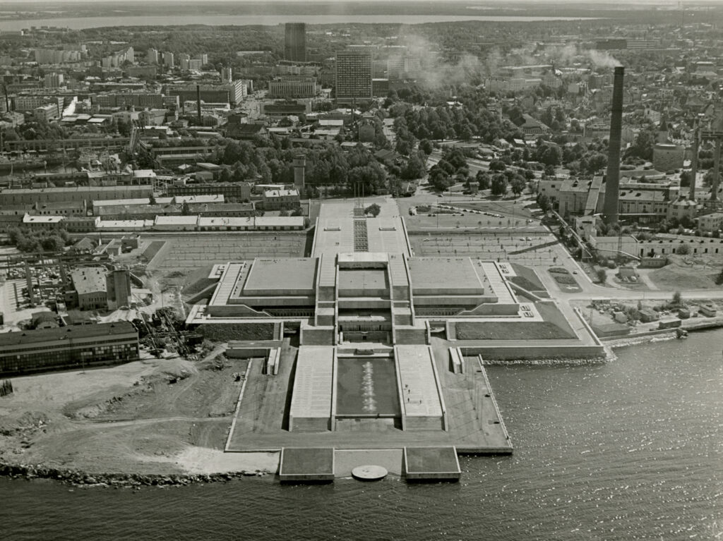
Aerial view of Linnahall. Photo by Raine Karp. EAM Fk 5065
-

-
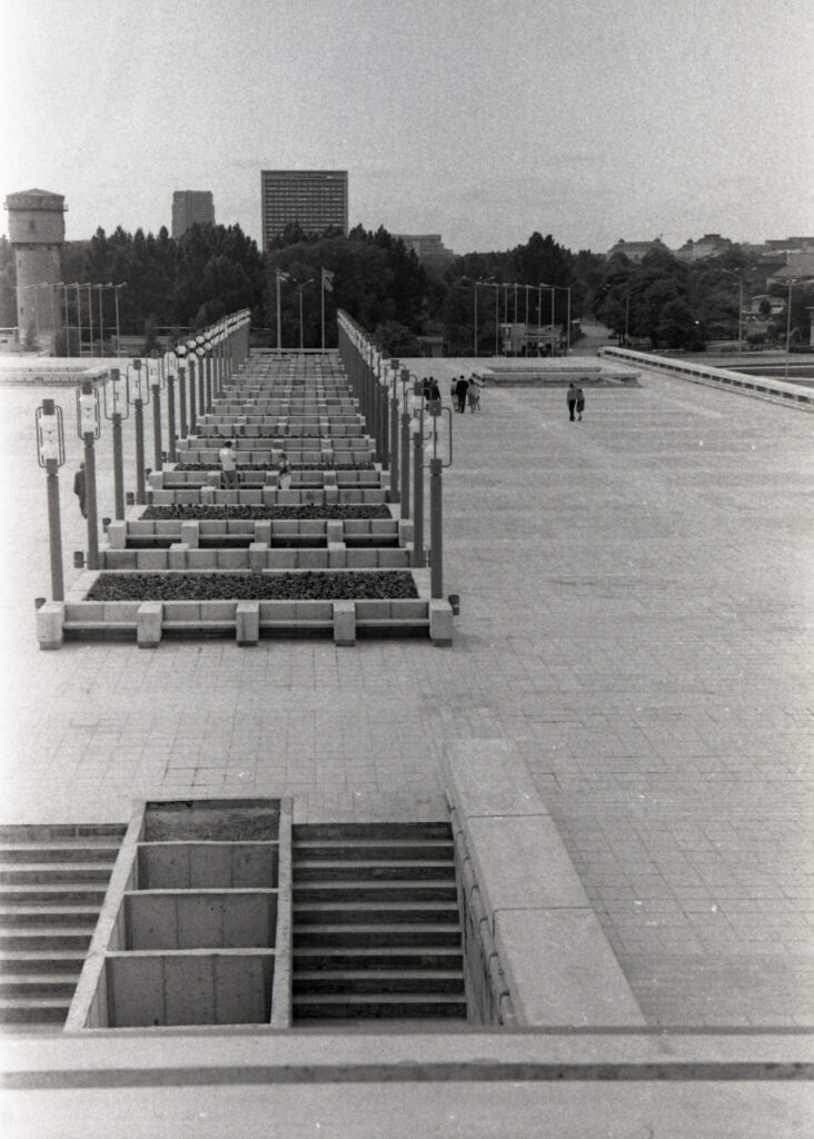
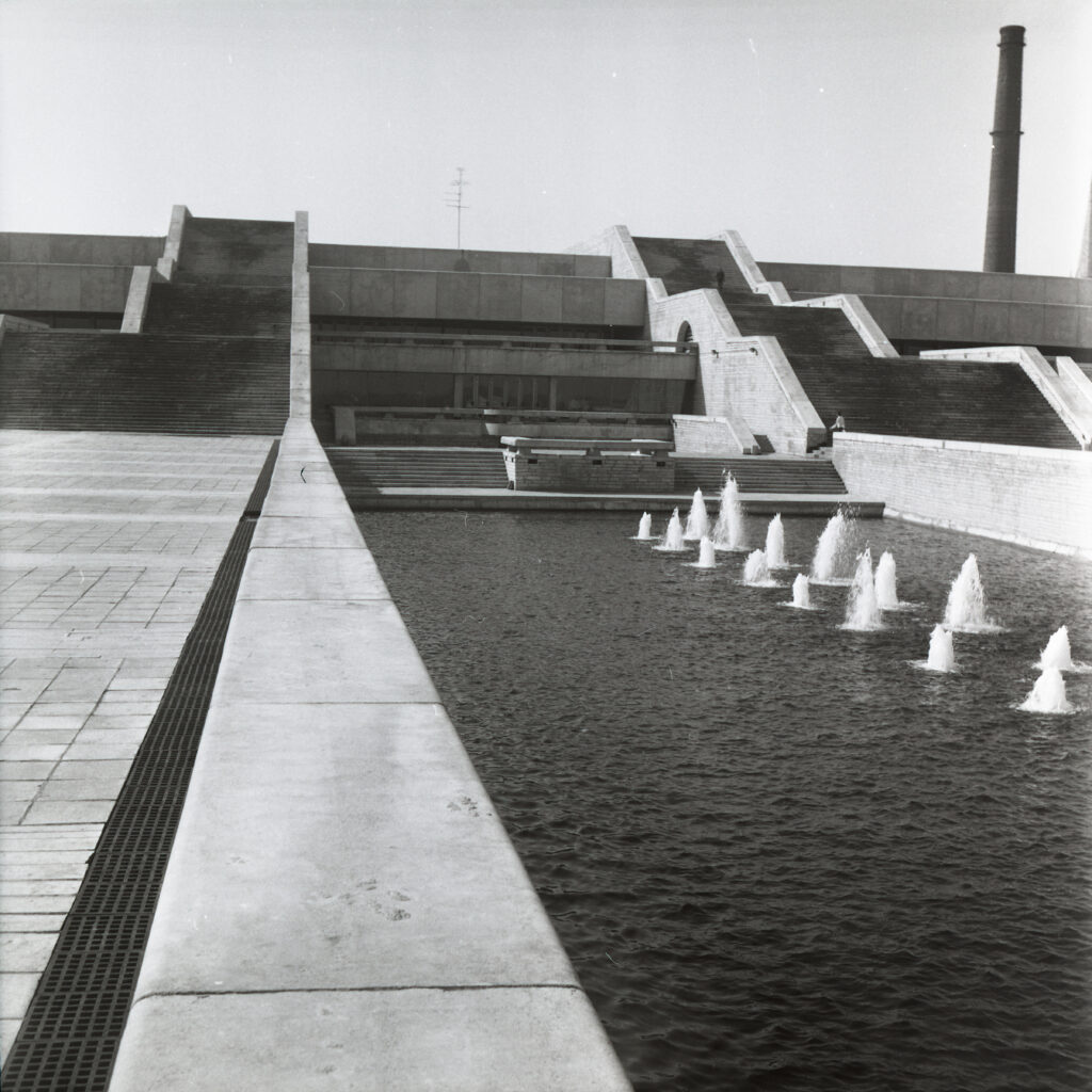
A city square on the rooftop. Photo by Kalju Suur, 1983. EAM Fk 1905
-

-
EAM Fk 11192
-

-
Photo by Aleksander Narusbek. EAM Fk 22977
-

-
EAM Fk 11188
-

-
Photo by Mari Kaljuste. EAM Fk 13186
-

-
Photo by Gunnar Nurmet, 1984. EAM Fk 2375
-

-
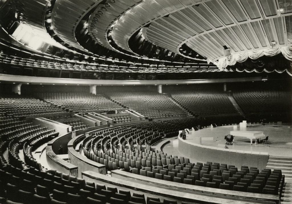
Concert hall. EAM Fk 5066
-

-
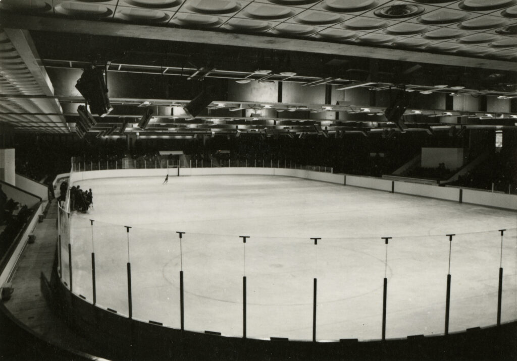
Ice rink. EAM Fk 5067
Linnahall. Architects Raine Karp ja Riina Altmäe, interior architects Ülo Sirp ja Mariann Hakk, 1980
Linnahall
Opened in the summer of 1980, Linnahall is one of the most notable buildings in Estonian architectural history. This monumental, low-rise building blends seamlessly into the surrounding landscape and bears similarities in form to ancient ziggurats, pyramids and Japanese architecture, as well as the bastions of Tallinn’s Old Town. It was designed by architects Raine Karp and Riina Altmäe, with interior design by Ülo Sirp and Mariann Hakk. Linnahall has become an important landmark, captivating local residents, curious tourists and architecture professionals from around the world.
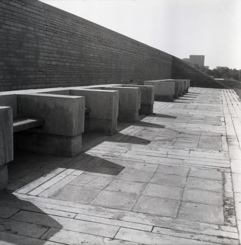
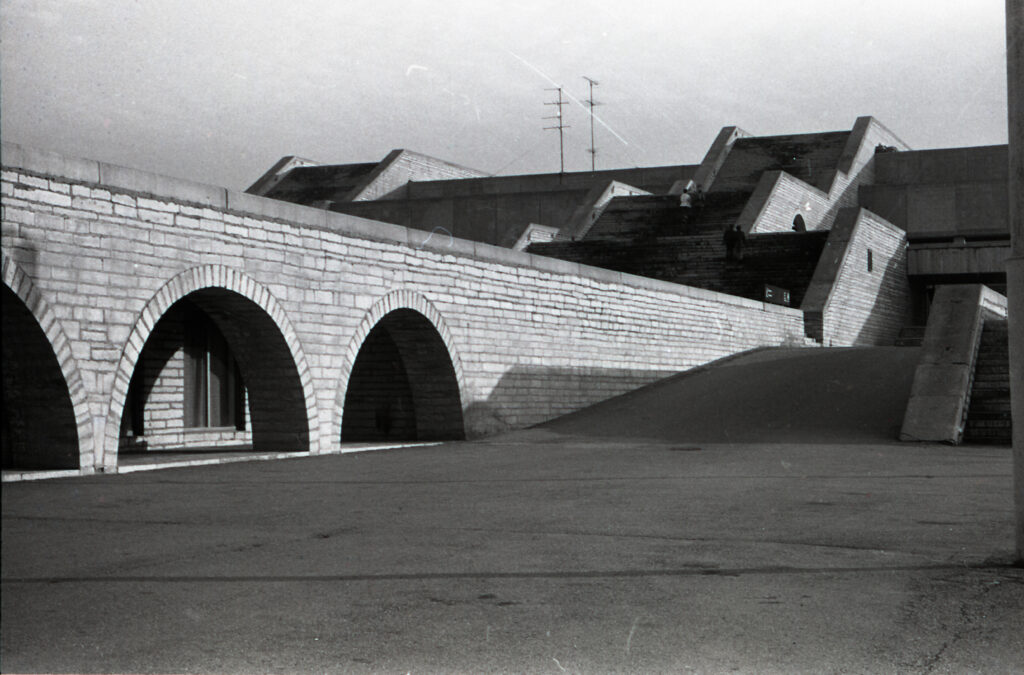
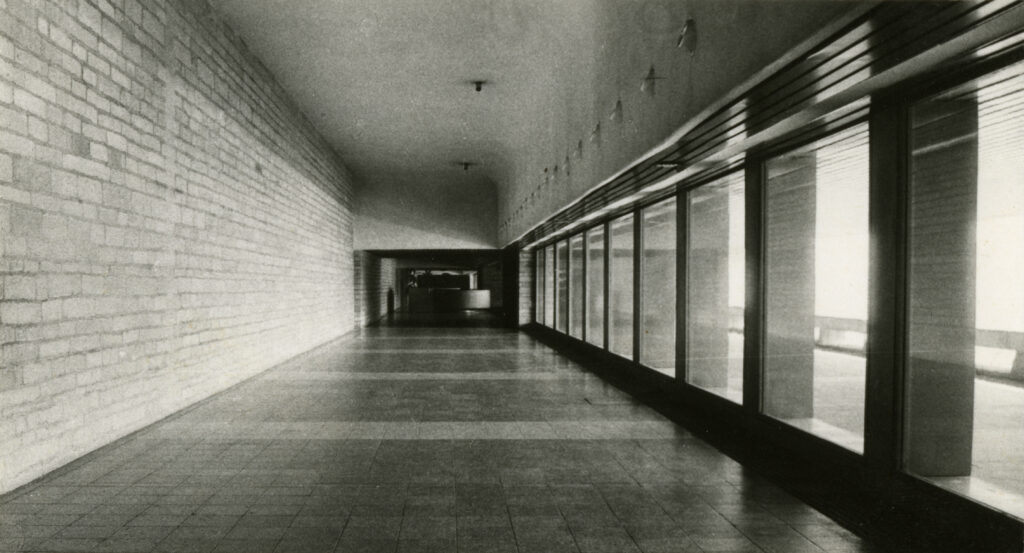
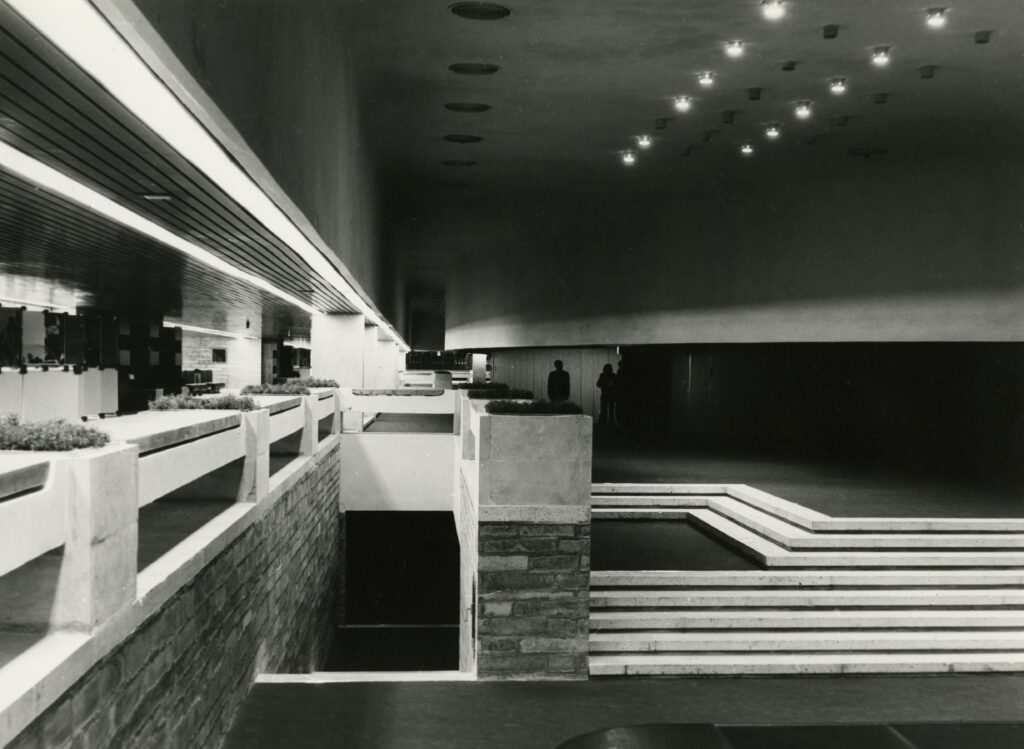
Linnahall is characterised by its symmetrical building volumes and ascending staircases. Arcades of various sizes soften the strictly geometric architecture. The low-rise section facing the city centre houses an ice rink with a capacity of 3,000 people. Above this, on the roof, is a spacious city square leading to the entrances of the concert hall. Beneath the square is a large transport corridor which was once traversed by a port railway and is now used by trams. At the heart of the building lies a unique, amphitheatre-shaped concert hall with seating for 4,200 people. Linnahall comprised many rooms serving various purposes, including cafés and bars located on different floors. Two low wings of the building facing the sea housed a smaller exhibition and concert hall, as well as a bowling alley.
Linnahall was built as a venue for cultural and sporting events. When it opened, Linnahall had the finest lighting and sound equipment, as well as an analogue recording studio which is still in use today. A significant amount of local pop music has been recorded there. Many internationally renowned musicians have performed at Linnahall (e.g., The Prodigy, Lou Reed, a-ha, Scorpions, and Philip Glass); it has hosted popular school and Christmas fairs, flower shows and numerous political events. The building gained international recognition in the film Tenet by American director Christopher Nolan.
Linnahall is a unique architectural masterpiece, added to the national cultural heritage list in 1997. The building has been closed to the public since 2010.
Text: Anna-Liiza Izbaš
-

-
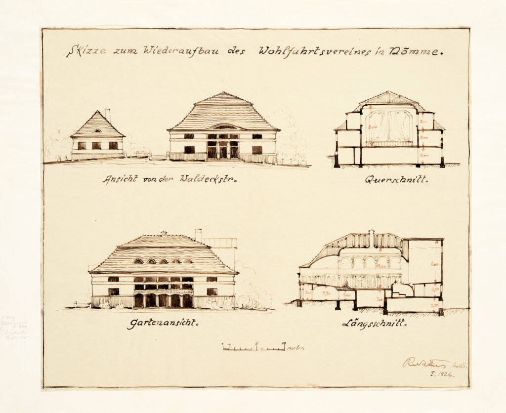
Sketch for the Nõmme Property Maintenance
Association building, 1926. Ink on tracing paper
Robert Natus, 1926. EAM 17.1.25
Sketch for the Nõmme Property Maintenance Association building
The Nõmme Property Maintenance Association had a strong community effect and played an important part in Nõmme receiving town privileges in 1926. The association (founded in 1908), which brought together local entrepreneurs and house owners, was constantly growing and therefore needed to reconstruct its building located on Õie Street. The extension with a spacious assembly room was made by the soon-to-be city architect Robert Natus. The sketches shown here illustrate the first stage of the project. In 1994, Mart Kalm handed over the archive of Robert Natus to the museum. From this collection of drawings and documents, personal fund no. 17 was created, which includes 80 items. It contains many projects related to Nõmme, such as the design of the Nõmme market building. Text: Sandra Mälk
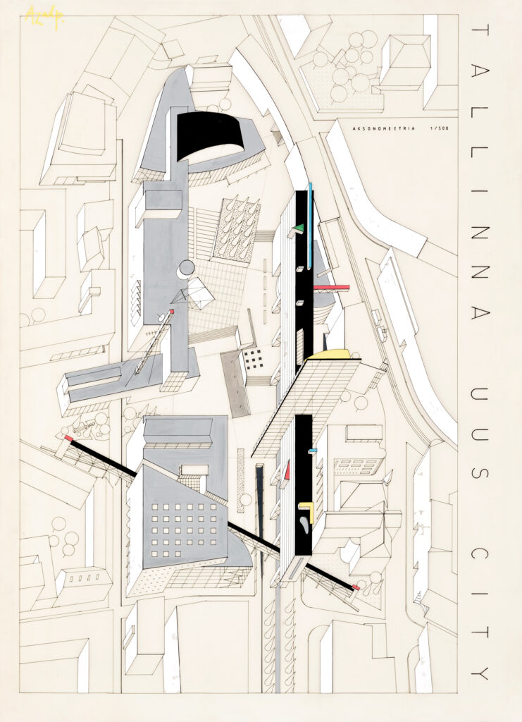
Andres Siim, Hanno Kreis, 1989. EAM 5.1.11
Competition entry for the new City of Tallinn
Widely discussed plans for an opera house in the historic Süda-Tatari Quarter in Tallinn in the 1980s gave cause for a new planning competition. Its purpose was to determine once and for all whether an opera house would fit the area. There were no significant restrictions established for the competition. Most architects as well as the authors of this particular competition entry primarily envisaged new buildings being erected to replace old ones. There were plans to preserve part of the landscaping, including a ginkgo tree which was under dispute at the time. This entry “Azalp” which placed 3rd in the competition would have seen the construction of a 21-storey hotel and several novel cultural institutions in the area. This drawing made in acrylic on plastic film was donated to the museum in 1993 by Andres Siim. Text: Sandra Mälk
-

-
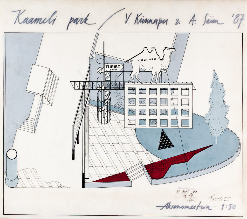
Camel Park, axonometry
-

-
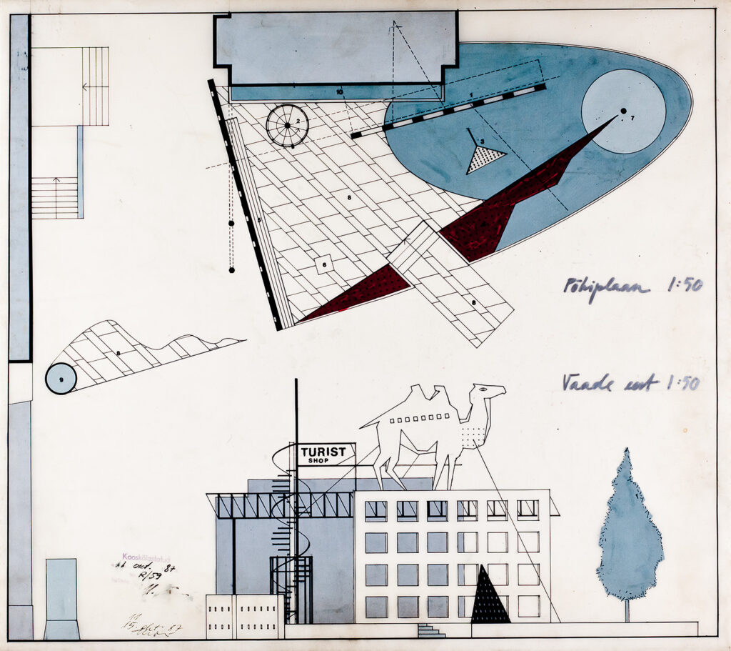
Camel Park, ground plan and front view
Vilen Künnapu, Andres Siim, 1987. EAM 41.1.17
Camel Park
At the beginning of Tartu Road in Tallinn, architects Vilen Künnapu and Andres Siim designed a modern urban park that combines a constructivist play of colour and form with architecture and advertising.
The urban park was designed above pavement level. The centrepiece of the design is a spiral staircase that shelters the outbuilding of the apartment building and provides access to the light bridge and a screen wall displaying an advertisement for the Turist shop. Perched on top of the wall, a giant camel catches the eye, gazing firmly at the shop below. The paved square is flanked by a retaining wall with a long bench on one side. Further away, in the corner of the apartment block, is a billboard.
The modestly landscaped park blends well with the square’s architecture and design. A red flowerbed crosses the area like an arrow, a triangular light fixture is placed on the lawn next to it and a conical oak tree crowns the top of the lawn. A climbing Virginia creeper shades the outbuilding next to the park.
The design was approved by Tallinn’s chief artist, Urmas Mikk, in 1987, but it was never realised.
Text: Anna-Liiza Izbaš
-

-

-
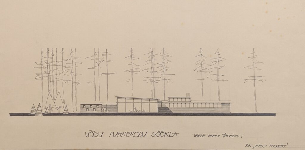
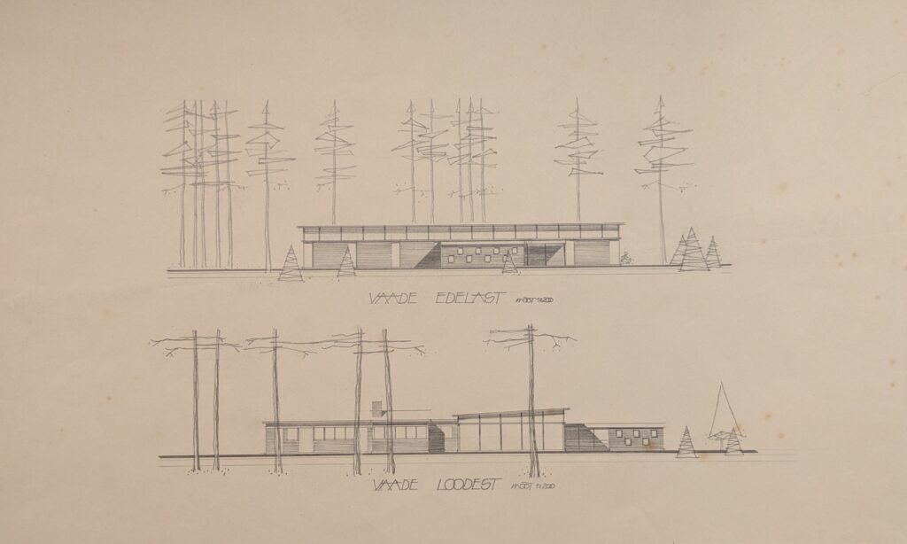
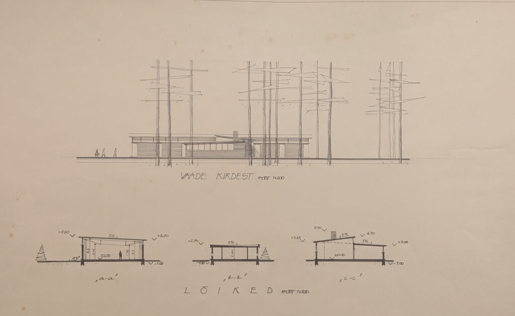
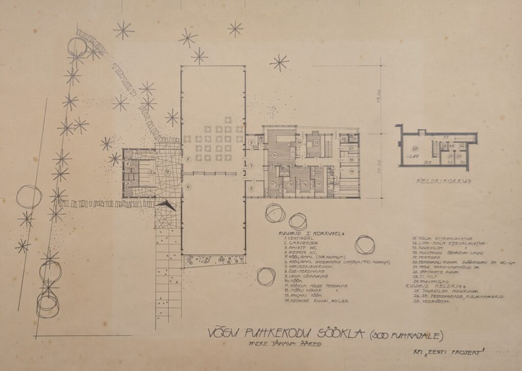
Canteen of the Võsu Vacation Home, 1961 (preliminary project). Heili Härmson, Lennart Sasi
-

-

Canteen of the Võsu Vacation Centre. Heili Härmson and Lennart Sasi, 1961. EAM 51.1.1
Heili Volberg-Raig 100 / Canteen in Võsu
On May 4, architect Heili Volberg-Raig celebrates her 100th birthday. We wish her much joy and health! Heili has donated great amount of filigree designs from her home archive to the museum. And since cafés and recreational facilities appear frequently in her work, we introduce a design for a modernist restaurant from 1961.
The Canteen of the Võsu Vacation Centre is one of the projects designed by Heili Volberg-Raig (then Härmson) as a long-time architect at the office of Eesti Projekt. She was helped by Lennart Sasi who was responsible for its engineering solutions. The canteen was in great demand in the popular Võsu summer resort, considering that the number of visitors could reach over 11,000 by the end of the season. At that time, Võsu Puhkekodu (Võsu Vacation Centre) was involved in the construction of several buildings necessary for the holiday. The new canteen was erected under the pine trees on the territory of the former Arnold Leihberg summer house, which is adjacent to the Võsu beach.
The canteen building, which was built on Mere Street, which runs parallel to the beach, was completed in 1964, offering shade and food for 300 visitors. No effort was made with the name of the canteen. Since there was already a canteen operating on the premises, the name Canteen No. 2 was hung above the door (see photos from the Virumaa Museum Võsu Canteen and Võsu Canteen No. 2 from the Estonian Health Museum). However, this building was much more modern than before, the building with spacious windows provided a view through the house directly to the seashore. The canteen had two halls, one of which was intended for families with children. According to the logical structure of the house, the cloakroom and kitchen were placed in the lower building blocks, leaving the spacious halls with a sloping roof in the center of the building.
After the restoration of independence, the illegally expropriated assets of the Võsu Holiday Centre were returned to their former owners or privatized, which began a new phase in the canteen era. The nightclub Seitsmes Taevas moved into the building. Unfortunately, in 2019, the building was demolished, having already been rebuilt from the original.
Text: Sandra Mälk
-

-
Excerpt from the winning entry “Kaared” in the Narva Old Town State School interior design competition (2024). Studio Argus OÜ and Arhitekt Must OÜ. EAM Dk 987
-

-
Excerpt from the protocol of the Maakri Quarter architectural competition (2024). EAM Dk 1072.1
-

-
Excerpt from the winning entry “Kubu” in the architectural competition for the design of the Keila Song Festival Grounds and its outdoor space (2020). Molumba OÜ, Mareld OÜ. EAM Dk 1119
-

-
Elva Verevi Beach Building Architectural Competition (2023) entry “Lesila” (2nd prize). JVR arhitektuuribüroo. EAM Dk 968
-

-
Excerpt from the winning entry “Mätas” of the North Tallinn Model Kindergarten Design Competition (2022). Inphysica technologies OÜ and Kuu OÜ. EAM Dk 810
-

-
Excerpt from the EBS Campus Architecture Competition (2020) entry “Cremona” (2nd prize). Alver Architects. EAM Dk 823
-

-
Excerpt from the Klindipark Landscape Architecture Competition (2022) entry “Klint Iistvuuduu jäljed” (3rd prize). Kino Maastikuarhitektid OÜ. EAM Dk 809
-

-
Excerpt from the entry work “Rebasesaba” (2nd prize) of the Maardu City Center Public Space Architecture Competition (2024). Studio TÄNA OÜ. EAM Dk 1048
Awarded works submitted to architectural competitions. EAM Dk 675 - Dk 1150
2020–2024 competition works in MEA collection
Estonia continues to hold many architectural competitions each year, around 30 of them public. It is a pleasure to look back and study the designs of buildings, landscapes and inventive interiors that have been recently completed or are about to be completed.
The museum’s digital collection was supplemented with works from public architectural competitions held between 2020 and 2024, which include not only the awarded works but also the commendations. The competition tasks and jury protocols are also invaluable for providing background information. Competitions have been organised all over Estonia, and among the objects there have been a relatively large number of competitions for squares, town centres and school buildings in the last five years. Beach houses and community centres also stand out. The high professional level of the competitions suggests that the most suitable solutions for their location have been found. Architects have given their competition entries very inventive keywords, but they love to give the names “Garden” and “Nest” in various forms.
In total, award-winning works from 117 architectural competitions (archive numbers DK 675 to DK 1150) were collected, recorded and supplemented with digital files. The works are visible in the Museum Information System in the digital collection of the Estonian Museum of Architecture, for example: Eesti muuseumide veebivärav – Audru keskväljaku arhitektuurivõistluse protokoll
The compilation was made possible with the help of the The Estonian Association of Architects, the Estonian Centre for Architecture, various local governments and the support of the Cultural Endowment of Estonia. Special thanks go to architect Kalle Komissarov, who did a thorough preliminary work compiling the competition information.
Text: Sandra Mälk
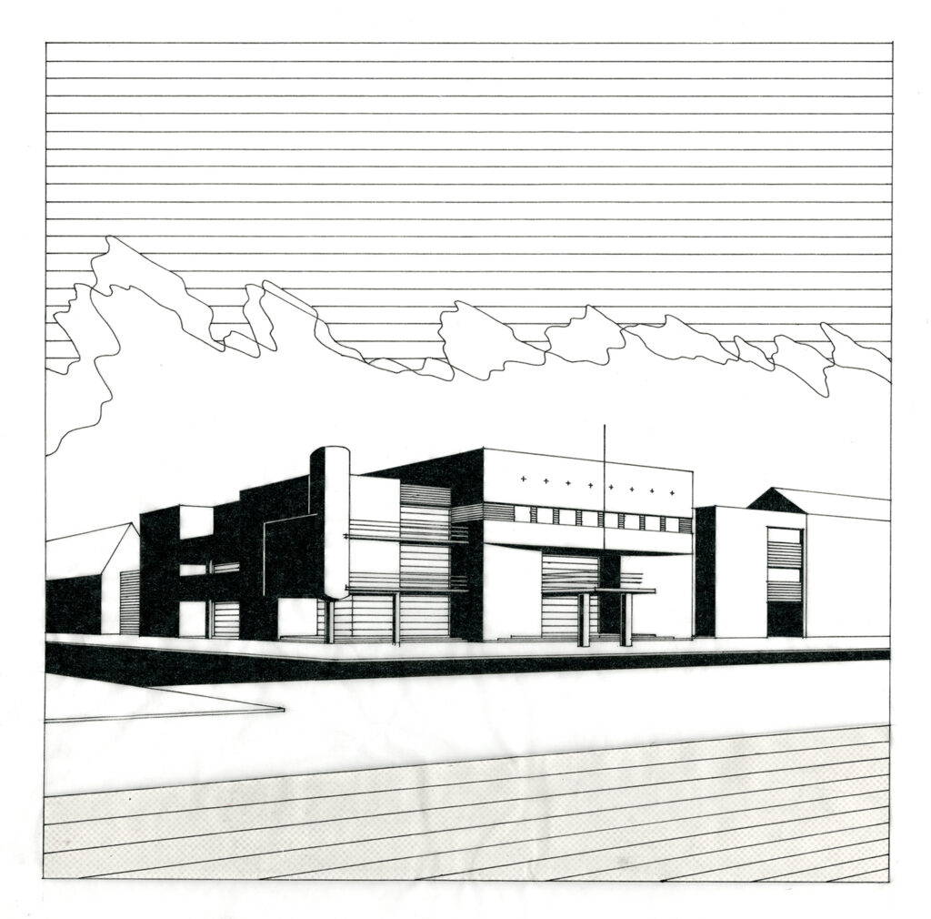
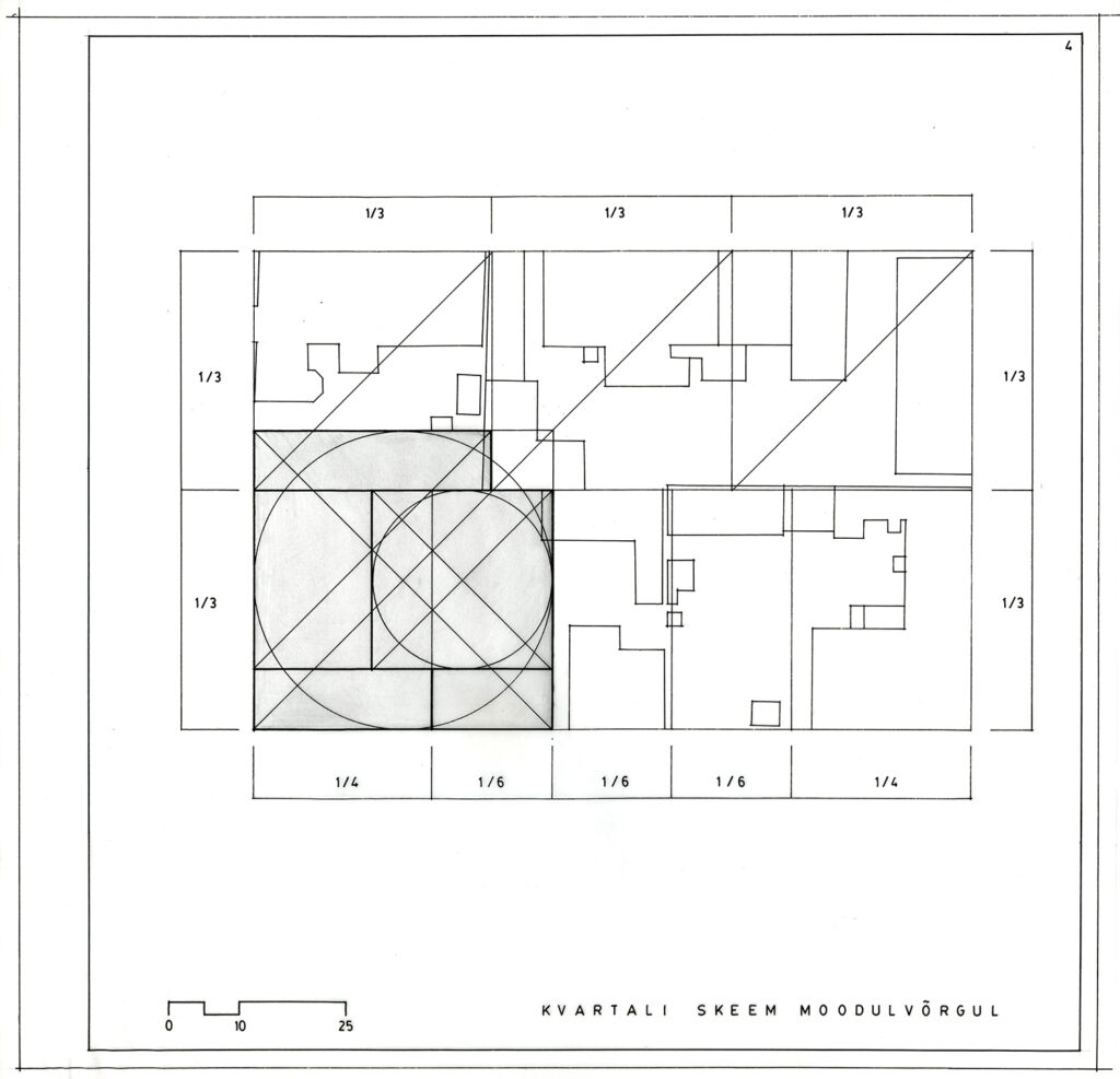
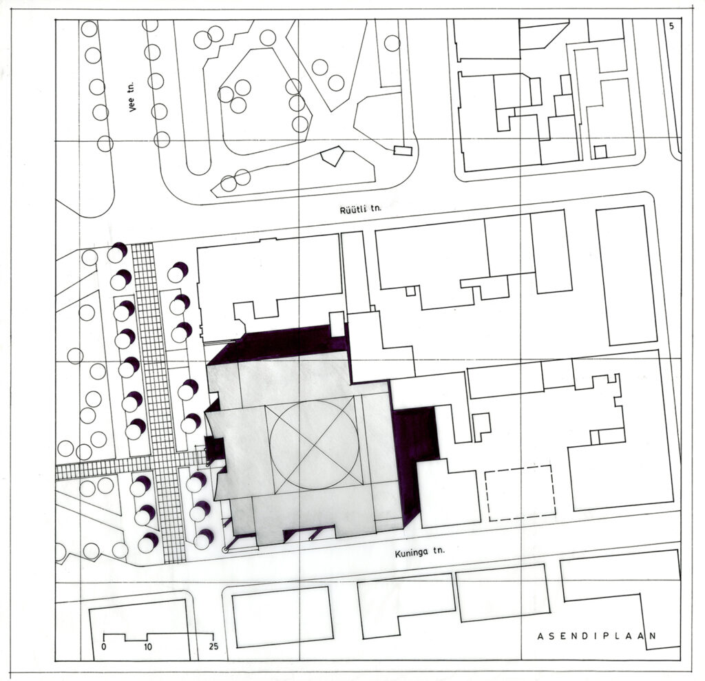
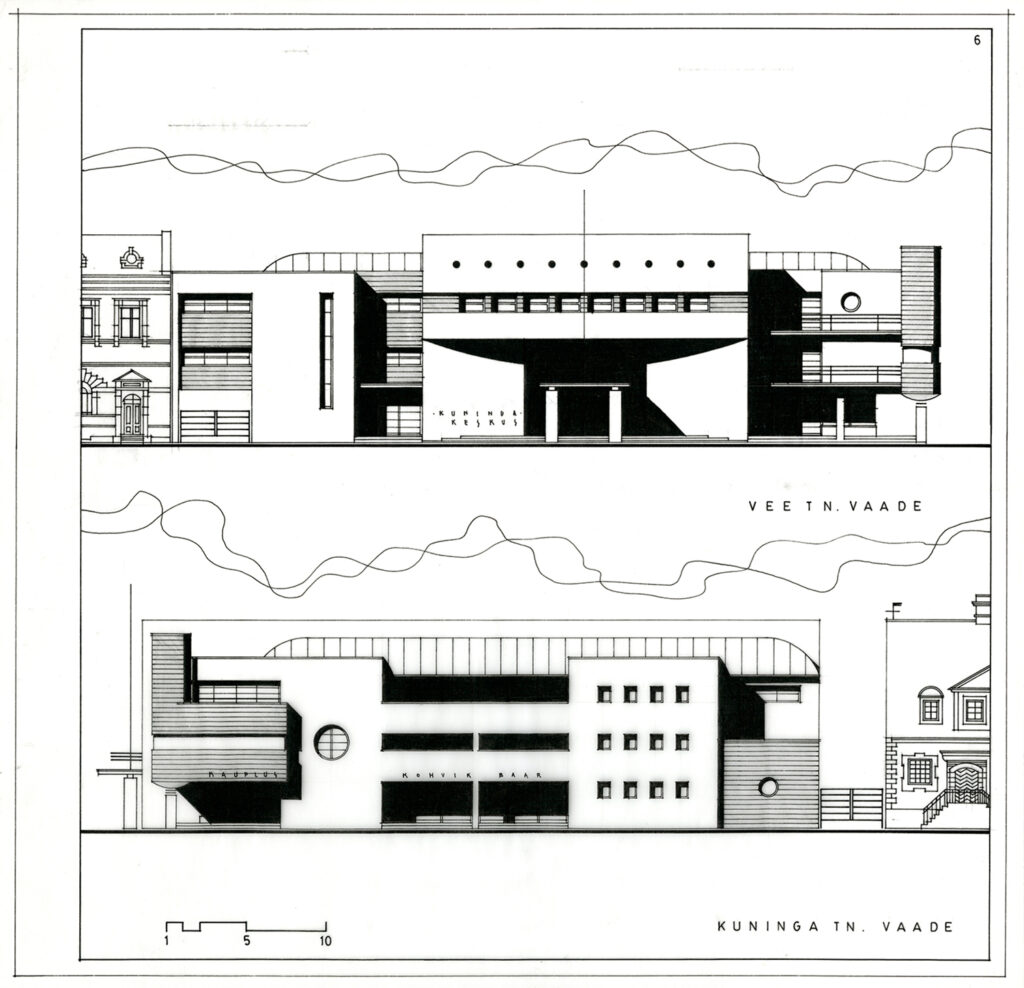
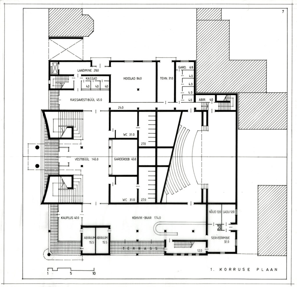
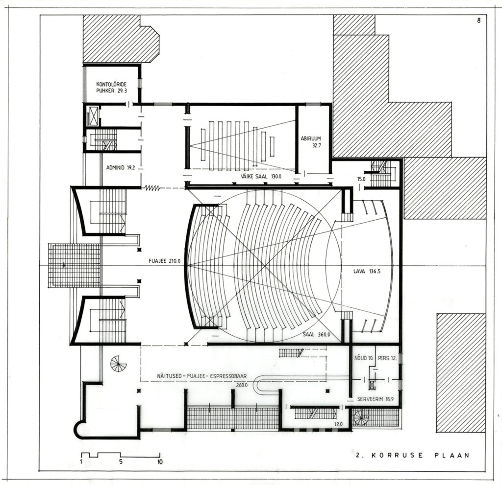
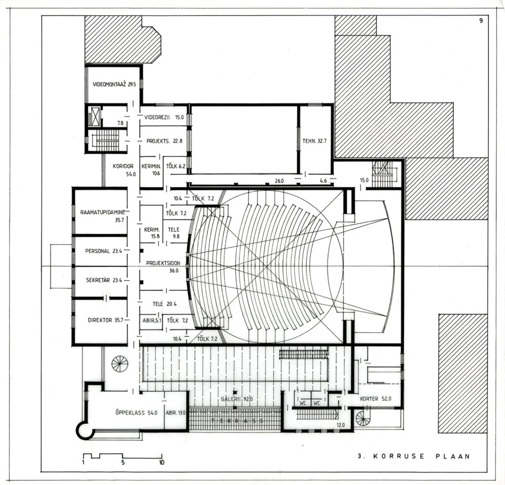
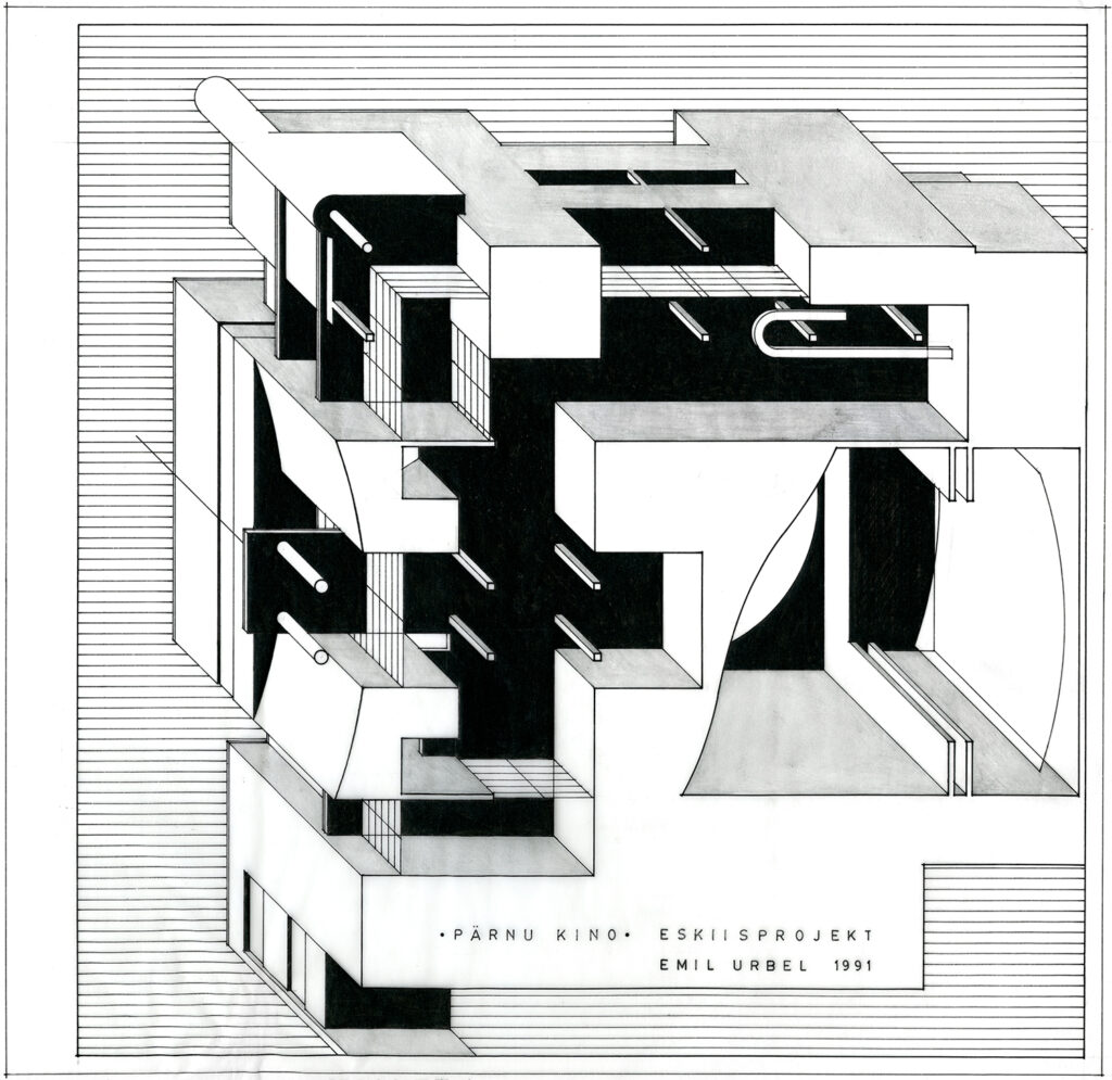
Emil Urbel, 1991. EAM 5.4.79
Pärnu cinema
The new cinema project in Pärnu is a fascinating example of architecture that was designed in the 1990s but never built. Designed by architect Emil Urbel, the cinema project entered into a dialogue with the city’s historical architectural tradition, using the modular land-use pattern of Pärnu’s city centre from the late 18th century as a basis for the layout of the neighbourhood and the design of the building. The new building was planned on the site of the Kiir cinema, which was to be demolished due to its obsolescence. The cinema building was to have two auditoriums, the larger with 420 seats and the smaller with 80 seats. Spacious corridors, a larger café and ancillary areas and a larger stage would allow the building to be used more flexibly for different types of events. On the third floor of the building, a housekeeper’s apartment with a separate entrance was planned, as well as a number of technical, office and ancillary rooms. The building was to be finished in white plaster and ceramic tiles, with the use of metal framing and steel detailing characteristic of the period. The area around the cinema on Vee Street was to be transformed into a spacious public space closed to traffic. Text: Anna-Liiza Izbaš
(To see more click on the image)


