-

-

-
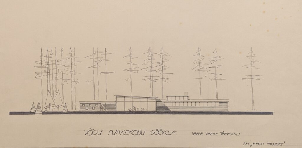
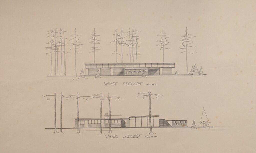
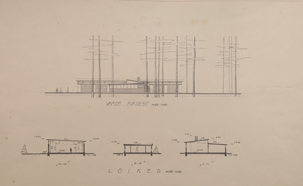
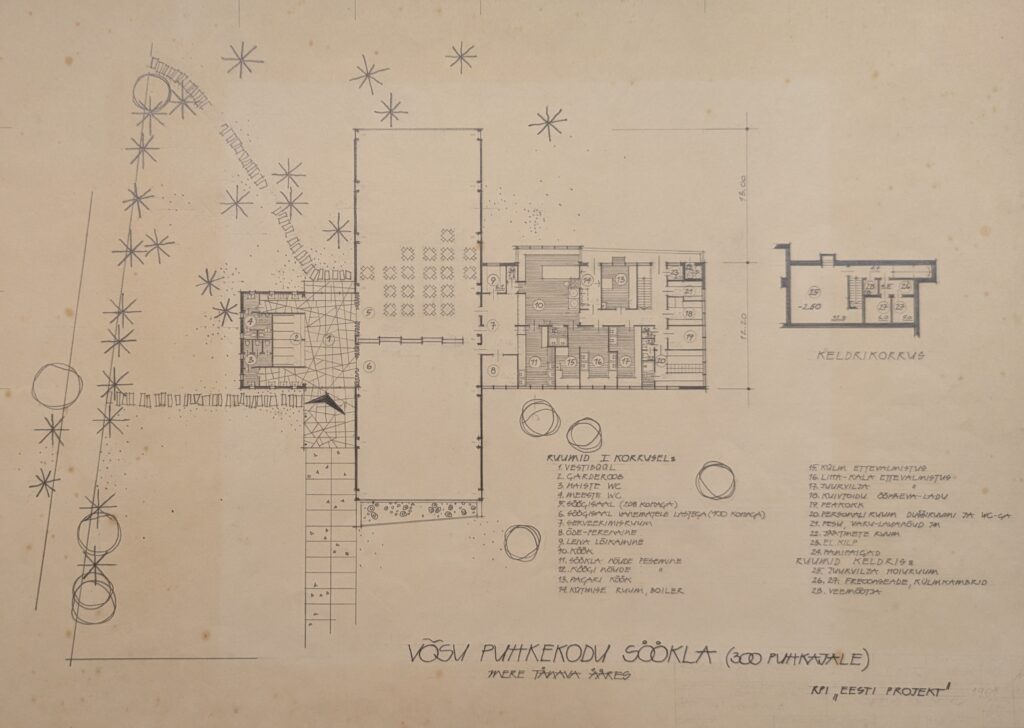
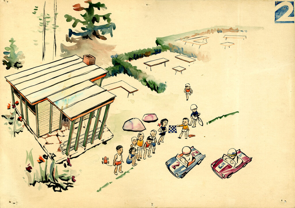
Canteen of the Võsu Vacation Home, 1961 (preliminary project). Heili Härmson, Lennart Sasi
-

-

Canteen of the Võsu Vacation Centre. Heili Härmson and Lennart Sasi, 1961. EAM 51.1.1
Heili Volberg-Raig 100 / Canteen in Võsu
On May 4, architect Heili Volberg-Raig celebrates her 100th birthday. We wish her much joy and health! Heili has donated great amount of filigree designs from her home archive to the museum. And since cafés and recreational facilities appear frequently in her work, we introduce a design for a modernist restaurant from 1961.
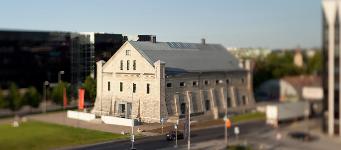
The Canteen of the Võsu Vacation Centre is one of the projects designed by Heili Volberg-Raig (then Härmson) as a long-time architect at the office of Eesti Projekt. She was helped by Lennart Sasi who was responsible for its engineering solutions. The canteen was in great demand in the popular Võsu summer resort, considering that the number of visitors could reach over 11,000 by the end of the season. At that time, Võsu Puhkekodu (Võsu Vacation Centre) was involved in the construction of several buildings necessary for the holiday. The new canteen was erected under the pine trees on the territory of the former Arnold Leihberg summer house, which is adjacent to the Võsu beach.
The canteen building, which was built on Mere Street, which runs parallel to the beach, was completed in 1964, offering shade and food for 300 visitors. No effort was made with the name of the canteen. Since there was already a canteen operating on the premises, the name Canteen No. 2 was hung above the door (see photos from the Virumaa Museum Võsu Canteen and Võsu Canteen No. 2 from the Estonian Health Museum). However, this building was much more modern than before, the building with spacious windows provided a view through the house directly to the seashore. The canteen had two halls, one of which was intended for families with children. According to the logical structure of the house, the cloakroom and kitchen were placed in the lower building blocks, leaving the spacious halls with a sloping roof in the center of the building.
After the restoration of independence, the illegally expropriated assets of the Võsu Holiday Centre were returned to their former owners or privatized, which began a new phase in the canteen era. The nightclub Seitsmes Taevas moved into the building. Unfortunately, in 2019, the building was demolished, having already been rebuilt from the original.
Text: Sandra Mälk
Mart Port, ca 1968. MEA 52.2.12
Sketches of Tallinn’s Väike-Õismäe residential neighbourhood
When designing the Väike-Õismäe residential neighbourhood, Mart Port and Malle Meelak – a shining tandem of Soviet-Estonian urban planning – seized the opportunity to shape it into an ideal city and avoid mistakes that commonly accompanied the construction of high-density housing projects. In the centre of the district designed for 40,000 residents, they placed an artificial lake with developments extending radially from it centre point. The drafts vividly convey Port’s genuine fascination with the concept of a ring-city. Compared with the earlier Mustamäe district, which was constructed as several independent micro-districts, Väike-Õismäe’s solution was unique and even so novel that there were numerous bumps along the road to gaining approval for its design. The architects had been expected to produce ordinary designs for an urban network, which would contain several smaller neighbourhoods and linear streets. This was precisely what Port and Meelak wished to avoid, instead producing a concentric street-plan with spacious outdoor areas that allowed for a more human dimension. Text: Sandra Mälk
Olev Randur. EAM 53.1.9
Smithy of the Tallinn hippodrome
The grand opening of the Tallinn hippodrome took place on November 25, 1923. A suitable location for horse racing was found in a raw land between Paldiski road and Kopli Bay, neighbouring the Seewald hospital complex and the former Baltika brick factory. On the Paldiski road was a grand wooden gatehouse with ticket counters, designed by architect Karl Burman. The historicist wooden main building and grandstand were located next to the almost kilometre-long horse racing track. The limestone stable building, designed by architect Artur Perna, was completed in 1938 and is the only surviving building from the original hippodrome complex. During the Soviet period, the hippodrome was reconstructed, and new stables, a grandstand and a gate replaced buildings that had previously been destroyed and demolished. The design of the smithy by architect Olev Randur was probably completed in the second half of the 1960s, when he worked for SDI Eesti Maaehitusprojekt (state design institute of rural architecture) and a reconstruction plan for the hippodrome was drawn up. Text: Anna-Liiza Izbaš
Voldemar Herkel, Mai Roosna, 1965. EAM MK 174
The passenger pavilion of the Port of Tallinn
The passenger pavilion in the Port of Tallinn was opened on July 7, 1965, when the travel connection between Tallinn and Helsinki, interrupted during the war, was restored. The pavilion, designed by architects Voldemar Herkel and Mai Roosna, reflected contemporary Finnish-influenced architecture. The walls of the pavilion were formed by shields with a load-bearing steel frame, which were filled with glass or partly with wood. The floor-to-ceiling glass walls of the building opened the view to the sea; wooden shields were used on walls where, based on the function of the rooms, more privacy was needed. In contrast to the wide white cornice of the horizontal roof, the building’s clapboards were covered with dark pine tar. Building ventilation and air heating pipes were placed inside the eaves, rainwater was drained from the corners of the roof. The unity of the interior and exterior of the pavilion was also important in the design. The suspended ceiling with strip lights used in the interior moved smoothly with the same rhythm over the ceiling of the canopy, the terraces of the building and the floors of the common rooms were covered with the same dolomite tiles. The partially landscaped courtyard in the middle of the building made the interior of the pavilion more spacious and added a little greenery to the harbour environment.There was a waiting room for international travelers in the seaside part of the pavilion, and a cafe-bar operated in the back of the room. A smaller waiting room in another side of the building was intended for passengers of local ship lines. In addition, there were offices, a currency exchange point and the foreign tourism office Inturist in the pavilion. The passenger pavilion was demolished a few decades after its completion. The model of the building was made by Peet Veimer in 2008 for the exhibition “Architect and his time. Voldemar Herkel” curated by Karin Hallas-Murula. Text: Anna-Liiza Izbaš
Nora Tammoja, 1964. EAM 11.1.32
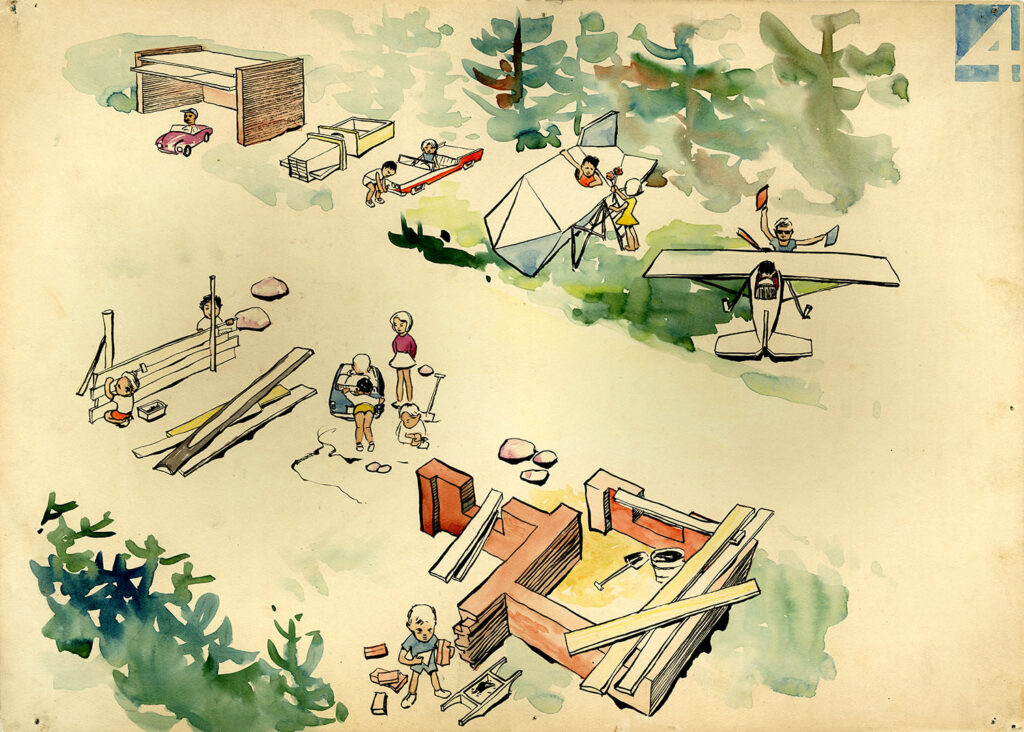
Children’s park in Sindi
Landscape architect Nora Tammoja has created numerous projects for urban green areas, cemeteries and children’s playgrounds. The design of children’s park in Sindi (Sindi Lastepark) was completed in 1964, the co-author of the project was architect Kaarel Pedak. The playground included playhouses and shelters, a climbing and sledding hill with a tunnel inside, a swing area, a traffic lane, a sandbox and a Robinson square. Robinson square was a playground construction site where children could build various buildings according to their imagination. The materials needed for construction were collected from various construction sites and were placed in the material warehouse on the playground. Since construction was considered primarily a boy’s activity, a separate play area for girls was planned in the park. The girls’ playhouse consisted of several rooms, one of which had a toy stove, and there was also a shop-pharmacy. In the middle of the playground was a two-way traffic lane with crosswalks and traffic signs. In the centre of the track was a circular traffic island intended for the position of a traffic controller. Sindi Lastepark with various play elements was mainly intended for preschool children and students of younger grades. On the back side of the project photo (EAM 11.1.69), it is noted that the work was awarded a silver medal at the National Economic Achievements Exhibition in Moscow in 1964. Construction work on the children’s park began in 1965, but probably not everything planned was completed. Text: Anna-Liiza Izbaš
(klick on the picture to see more illustrations)
Mart Port, Uno Tölpus, Raine Karp, Olga Kontšajeva, 1963. EAM 4.3.2
Estonian Ministry of Foreign Affairs building
The 11-storey administrative building influenced by the American so-called International Style was completed in the Tallinn city centre in 1968. The symmetrical facade of the building is characterized by regular rows of ribbon windows and a vertical windowless central part, which was supposed to form the background for the statue that stood in front of the building. The building has a U-shaped ground plan. On the first floor of the office building is a spacious vestibule, the walls of the vestibule were covered with pink Cuban origin marble. The offices are located on the following floors, the utility rooms are on the top floor. Conference and meeting rooms are located in the wing buildings, there is a courtyard in the middle of the building parts. A broad hyperbolic paraboloid-shell made of reinforced concrete covers the large conference hall located in the left wing of the building. Due to the complex construction, the lights were installed on the walls of the room and the ceiling was covered by 60,000 empty sprat boxes. The oiled and round sprat boxes helped to diffuse and reflect the light directed at them and ensured good acoustics in the hall. The location of the building is also significant. The office building was built on the site of the Estonian Academy of Sciences, which was foreseen by 1948 Tallinn Cultural Centre design plan (architect Harald Arman), on the other side of the Theatre Square is the “Estonia” theatre – politics and power is facing culture and spirituality. Since the autumn of 1991, the Estonian Ministry of Foreign Affairs has been operating in the former Estonian Communist Party Politburo building. The author of the drawings is Rein Kersten. Text: Anna-Liiza Izbaš
(klick on the picture to see more illustrations)
-

-
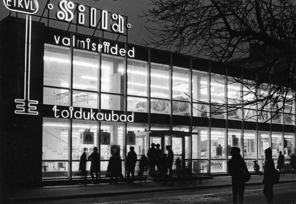
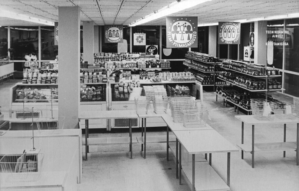
Shop “Silla” in Pärnu, photo by Rein Vainküla
-

-
Shop “Silla” in Pärnu, photo by Rein Vainküla
Rein Heiduk, 1964. EAM 6.4.7:76. Photo: Rein Vainküla
Shop “Silla” in Pärnu
In 1968, a newly opened shop designed by Rein Heiduk on Silla street in Pärnu attracted the attention of passers-by with a modern look. Reminiscent of a glass pavilion, the store “Silla” hid food products on the first floor and industrial goods on the second floor. When writing about the architecture of the building, the architectural historian Leonid Volkov has referred to its connections with both the international style and the constructivism of the 1920s (L. Volkov’s manuscript “Eesti arhitektuur 1940-1989. Part II, p. 103). The Estonian Consumers’ Cooperative Union (ETKVL) was responsible for the fresh production of the store network that consolidated the pan-Estonian trade network and, for example, opened the Tapa department store, which was also designed by Rein Heiduk (1966). In 1994, Leonid Volkov’s wife Helga Volkov handed over a manuscript dedicated to Estonian architecture to the museum along with a rich photo collection. The house was photographed by Rein Vainküla. Text: Sandra Mälk
-

-
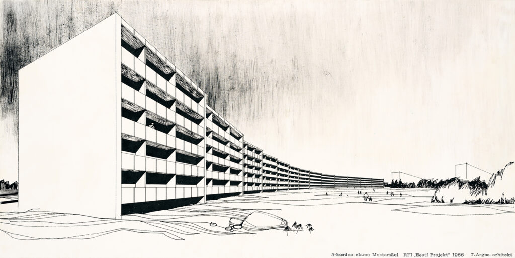
Design of an apartment building in the Mustamäe II microdistrict. Tiiu Argus, 1966
Tiiu Argus, 1966. EAM 4.2.3
Five-storey apartment building in Mustamäe, Tallinn
The Mustamäe district, which was erected in Tallinn in the 1960s, was divided up into microdistricts that were designed to accommodate 6,000–10,000 residents. The monolithic form of the panel apartment blocks designed for the second microdistrict is based on the development of prefabricated panels, permitting the construction of buildings with five or more storeys, not just four storeys like before. In the context of the depreciated housing options at the time and before the microdistricts became dormitory suburbs, the first panel apartment blocks that dominated the landscape looked innovative. They were thought to display a community effect and bring neighbours closer together. This ink drawing was given to the museum by design office Eesti Projekt in 1992. Text: Sandra Mälk
-

-
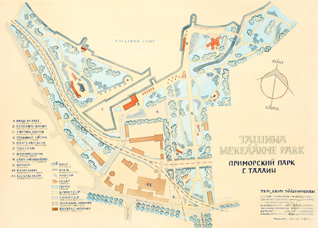
Tallinn Waterfront Park, 1960
Lidia Pettai, 1961. EAM 15.4.150
Seaside park in Tallinn
60 years ago, the opening of the Tallinn sea border was under discussion with the intention of turning it into a green area with port facilities. Back then, In the 1960s, and primarily at Finland’s initiative, plans were made to clear up all the areas surrounding the port with regard to the reopening of the Tallinn-Helsinki seaway and the construction of the passenger port. The seaside area – in the immediate proximity of Old Town – was partly in the military zone and opening it up to the city became a lively issue. Although, only a handful of buildings were fixed up during the Soviet era. New buildings were due to be constructed in the densely built-up industrial area together with the main park road that was in the direction of Mere Boulevard (No. 1), such as the beach café (7), the port building (3) and children’s playgrounds (8). A team of architects worked with the design at the Eesti Tööstusprojekt. Kalju Vanaselja designed the buildings and H. Parmasto behind the schemes of coastal reinforcements. The plan was designed by architect Lidia Pettai, whose watercoloured work was given to the museum in 2012 by Reet Priilaht. Text: Sandra Mälk
-

-
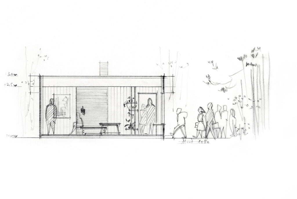
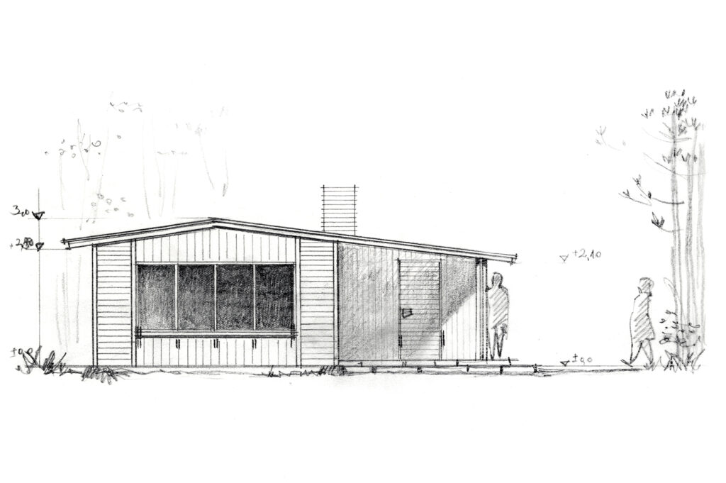
Pavilion at Nigula bog, Ethel Brafmann, 1964
-

-
Pavilion at Nigula bog
-

-
Pavilion at Nigula bog
Ethel Brafmann, 1964. EAM 35.1.105
Pavilion at Nigula bog
The pavilion is located close to the Latvian border in Pärnu County in Nigula Nature Reserve, which was established in 1957. Ethel Brafmann, a young and promising landscape architect at the time, made the design for the pavilion on the territory of the nature reserve. The purpose of the pavilion is to allow travellers to rest and prepare food while in the middle of a display dedicated to the nature reserve. The wooden pavilion is equipped with a stove and consists of a single 27 m2 room, a kitchen and a small hall with windows with shutters. The drawings originated from the collections that were donated to the museum at 2006 by Inga Tõnissar. Text: Sandra Mälk
(klick on the image to see more pictures)
-

-
Interior design of the Composers’ house in Tallinn
Vello Asi, ca 1960–1964. EAM 4.14.4
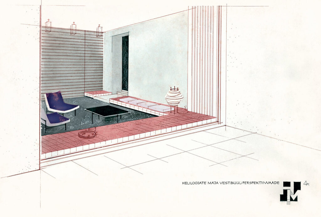
Interior design of the Composers’ house in Tallinn
The drawing by interior designer Vello Asi depicts a view of the vestibule of the Composers’ House (architects Udo Ivask and Paul Härmson, completed 1964) located on Lauter Street in Tallinn – straight from the street through a big window. The aerial-looking interior with eye-catching low-sitting furniture is designed in the spirit of the 1960s. As was characteristic of the era, the interior designers picked up pointers from Nordic architecture literature that had just become accessible. This new approach to interior design valued open space, horizontal lines and light furniture that could be moved around with ease; it also favoured an inclusive environment to facilitate spending time in passable rooms. The drawing made with ink and watercolours was acquired by the museum in 2017. Text: Sandra Mälk
Mart Port, 1962. EAM 52.2.11
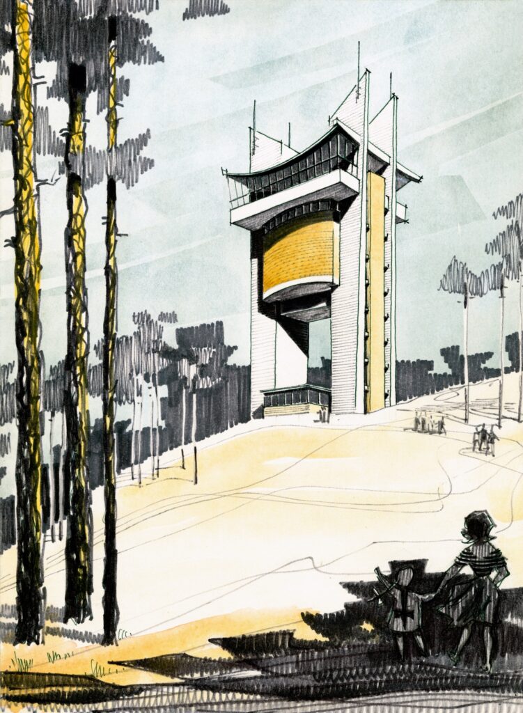
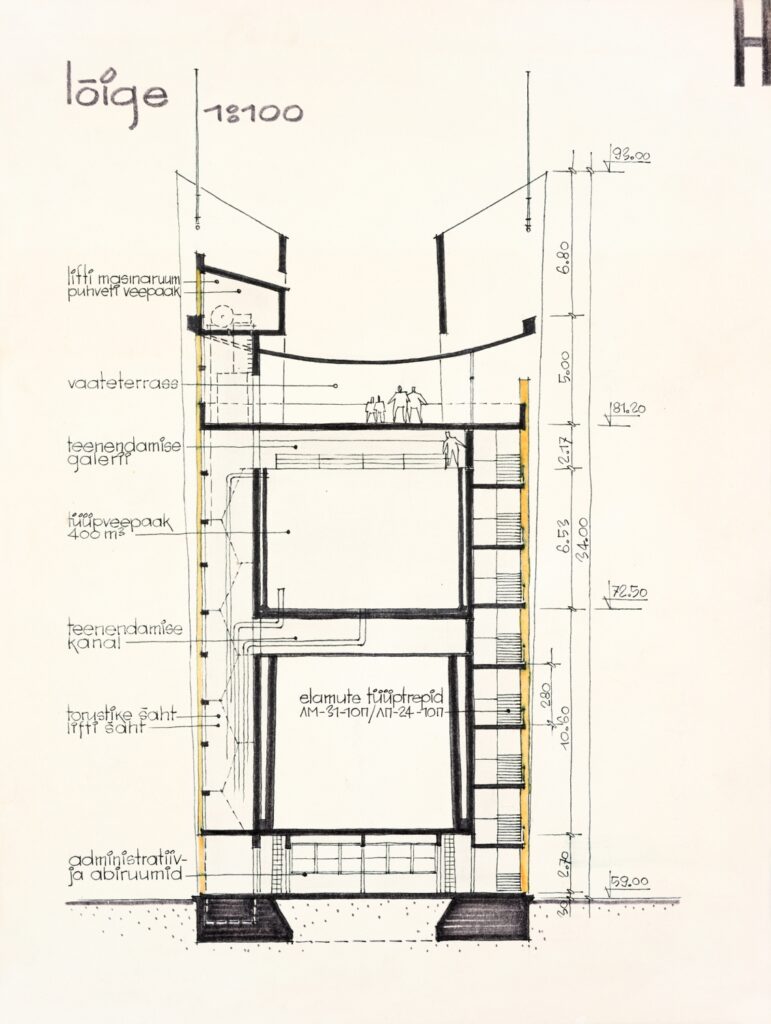
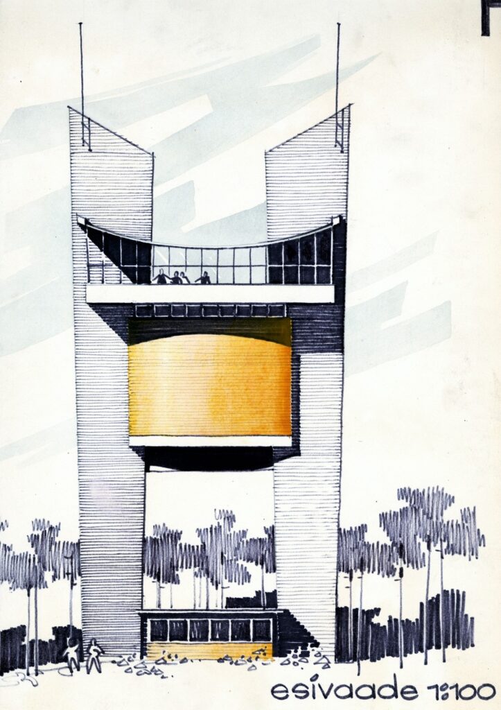
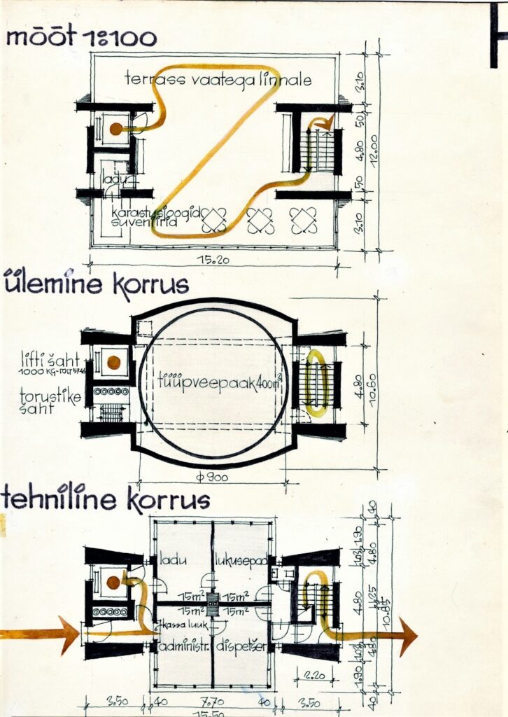
Competition entry for the observation and water tower in Mustamäe
The quality of the entry submitted for the competition for the observation and water tower that was due to serve the Mustamäe district in Tallinn lies in its pure technically engineered form. The modern concave roof of the lookout platform was possible thanks to the use of reinforced concrete. The area was under intense development at the time: the ski jumping tower on top of a hill slope in Mustamäe had been completed a year earlier and there were plans to build the campus of the university of technology at its foot. The perspective view shows an architectural drawing style that was common at the beginning of the decade where the classical watercolour and ink drawing has been completed using a wide dark-coloured felt-tip pen. The tower was never built. The drawings from Mart Port´s home archive were given to the museum by his family. Text: Sandra Mälk
-

-
Interior design for Hotel Viru
-

-
Interior design for Hotel Viru
Vello Asi, Väino Tamm, Loomet Raudsepp, 1964–1968. MEA 4.2.2
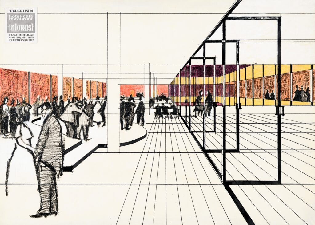
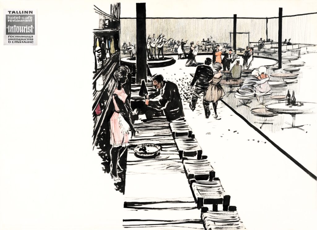
Interior design for Hotel Viru
Hotel Viru (architects Henno Sepmann, Mart Port) was the highest and most modern hotel building in Soviet Estonia. It was primarily targeted at guests from Finland because the Tallinn-Helsinki seaway was reopened in 1965. However, locals were also able to access the bars and cafés of the hotel. The drawings illustrate a restaurant and a bar on the lowest volume of the building. The simplistic style reflected in the interior and the free plan indicate influences by modern Nordic room design – the opposite approach to the extravagant decade that preceded it. Drafts for the interior of Hotel Viru were to the museum by Eesti Projekt in 1994. Text: Sandra Mälk


