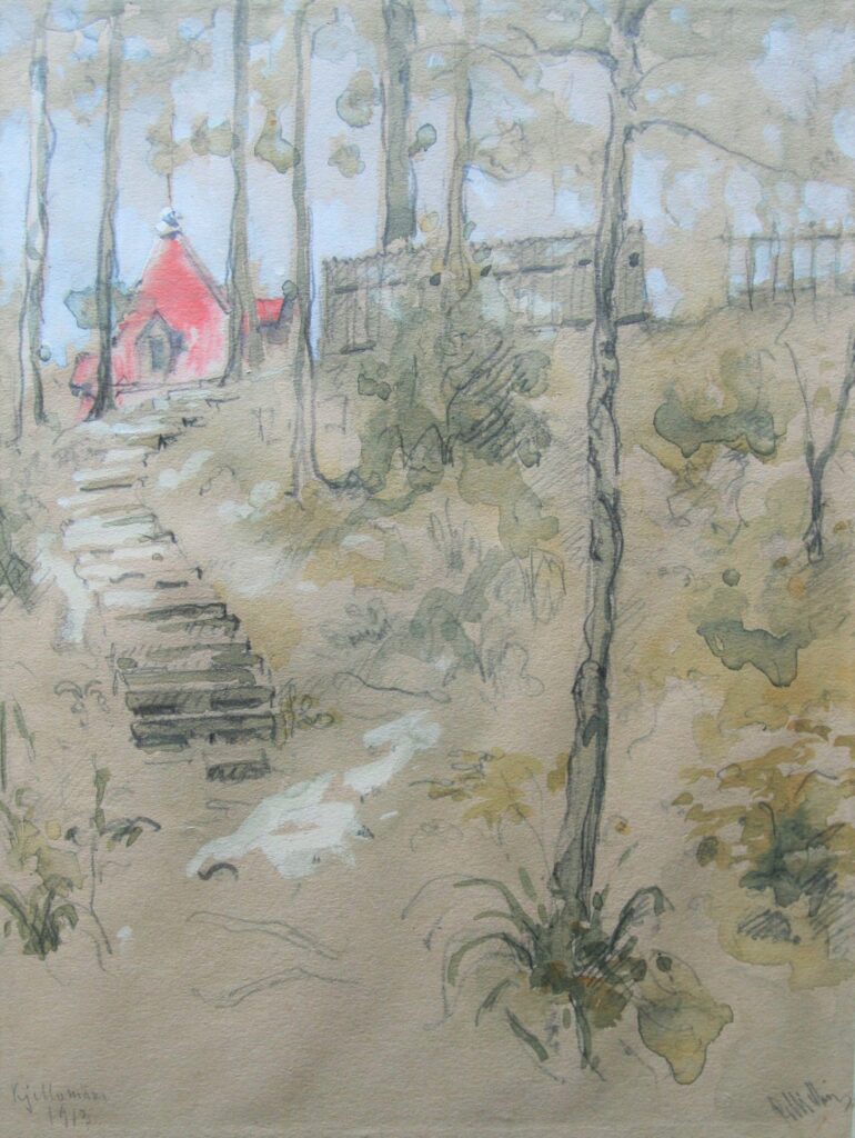
Paul Mielberg, 1913. EAM K 37
Kellomäki Motif
Paul Mielberg, architect and lecturer at the University of Tartu 1922–1940, was born on March 18, 1881 in Tbilisi (Georgia). His father, Johannes Mielberg from Viljandi County, was the director of the Physics Observatory in Tbilisi. From 1899 to 1901, Paul Mielberg studied at the Riga Polytechnic Institute, afterwards at the St. Petersburg Academy of Arts, where he received a diploma of Artist-Architect in 1910. After graduating, Mielberg worked for several well-known St. Petersburg architects. From 1911 to 1918, he was the chief architect of the Swedish architect Fredrik Lidval (Karl Burman also worked as Lidval’s assistant a few years before), participating in the design and construction of St. Petersburg Art Nouveau landmarks such as the Azov-Don Bank and Count Tolstoy’s tenement house. In 1922, Mielberg came to Tartu and became an associate professor of construction studies at the University of Tartu and also an architect of the university. More than a dozen buildings belonging to the university were built or reconstructed according to his design or supervision. On December 18, 1996, art historian Andres Kurg wrote a review article about Paul Mielberg’s role as an architect of the university in Postimees “About the Architect who designed the university and the Tähtvere district”.
Paul Mielberg left Estonia in 1941 and died in 1942 in Germany.
In 2010, the architect’s daughter Olga Kompus donated her father’s watercolors from 1911–1913 to the museum. Kellomäki, a popular summer resort and excursion destination in Karelia on the Gulf of Finland, about 40 km from St. Petersburg, is a sketchy romantic landscape with Art Nouveau handwriting. For moody views of the Kellomäki, see the video: https://www.youtube.com/watch?v=1ACNcIEXRIM
Text: Anne Lass
-

-
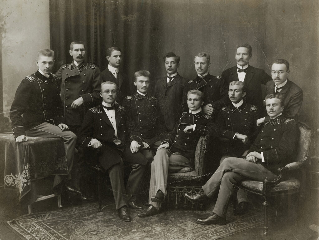
Riga Estonian Students’ Society, 1909
Riga Estonian Students' Society, 1909. EAM.16.4.71
Riga Estonian Students’ Society
The Riga Polytechnic Institute became one of the most important providers of technical education in the 19th and 20th centuries, where well-known Estonian architects, engineers, industrialists and others studied. At that time, it was one of the closest schools for studying architecture next to the St. Petersburg Academy of Arts. The Tallinn Technical School (Tallinna Tehnikum) was established not until 1918. By the new century, there were already many Estonian students at the Riga Polytechnic Institute that several corporations were formed to unite the students. The picture probably shows the founders of the Riga Estonian Students’ Society (later the Student Society Liivika), which was formed in 1909. These young students are future architects, engineers and industrialists who have greatly influenced Estonian society. According to their educational background, they were later called “riialased”, the Rigans.
Sitting Left to the Right: architect Anton Soans, Anton Uesson – the later mayor of Tallinn and Karl Treumann (Tarvas). Standing Left to the Right: Karl Feldmann (?), Architect Aleksander Bürger, banker Heinrich Väljamäe, engineer Konstantin Zeren, lawyer Voldemar Tomson, Peeter Sisask (?). The photo was purchased from an antique shop in 2020. Text: Sandra Mälk
-

-
Weekend house project
-

-
Weekend house project
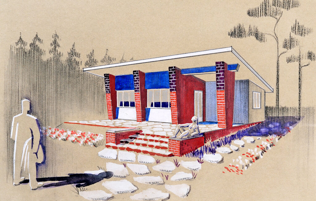
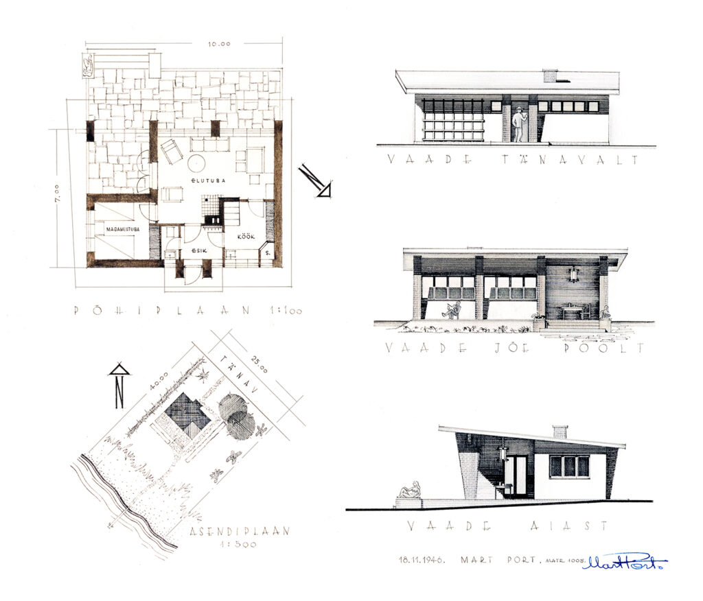
Mart Port, 1946 EAM 52.1.8
Weekend house project
The term ‘weekend house’ (Estonian nädalalõpumaja) was introduced in the 1930s, when recreation and the new types of premises related to it started to gain wider popularity. Small cottage-type houses came to be built in Merivälja near Tallinn, but also in Vääna, Vasalemma and other places. These light one-storey summer houses with a couple of rooms meant as a quick weekend getaway for working people were fundamentally different from the large summer villas of wealthier people at the beginning of the 20th century. Recreation became part of the daily lives of the progressive Estonian middle class. Mart Port already designed his weekend house as a student project shortly after the war, borrowing both the name of the project and its generous spatial structure (the floor area of 70m2 is more than luxurious considering the era) from the first period of Estonian independence, adding load-bearing stone walls boldly visible on the facade and a strange female form in stone on the terrace almost as if greeting a man arriving at the property. Approximately ten more years passed before recreation and cottages actually became an important part of the Soviet ideology and the inalienable right of every working person. Moscow ordered the development of the first standard designs for summer houses – cheap wooden buildings with a floor area of just over 20m2, which could be erected both in gardens and the forest. Mart Port and Ülo Elland also designed one of these, which, like Port’s former student work, had a one-sided sloping roof and a front terrace, yet the house itself already consisted of prefabricated elements. The spread of the cottage culture to the masses had begun. Text: Triin Ojari
-

-
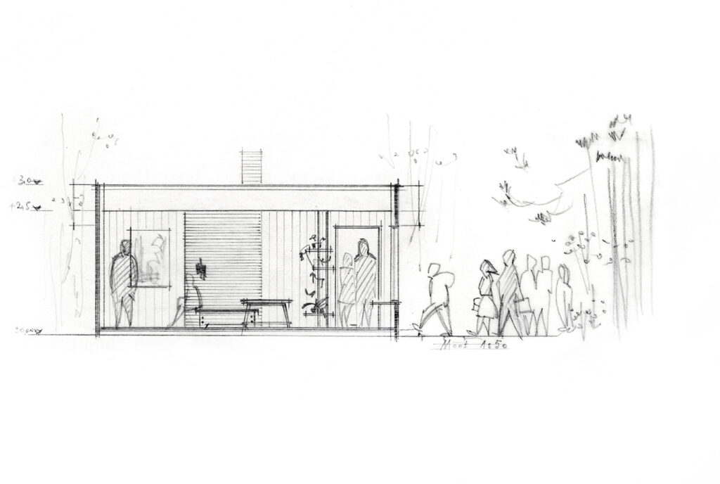
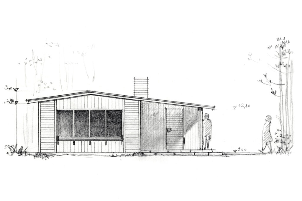
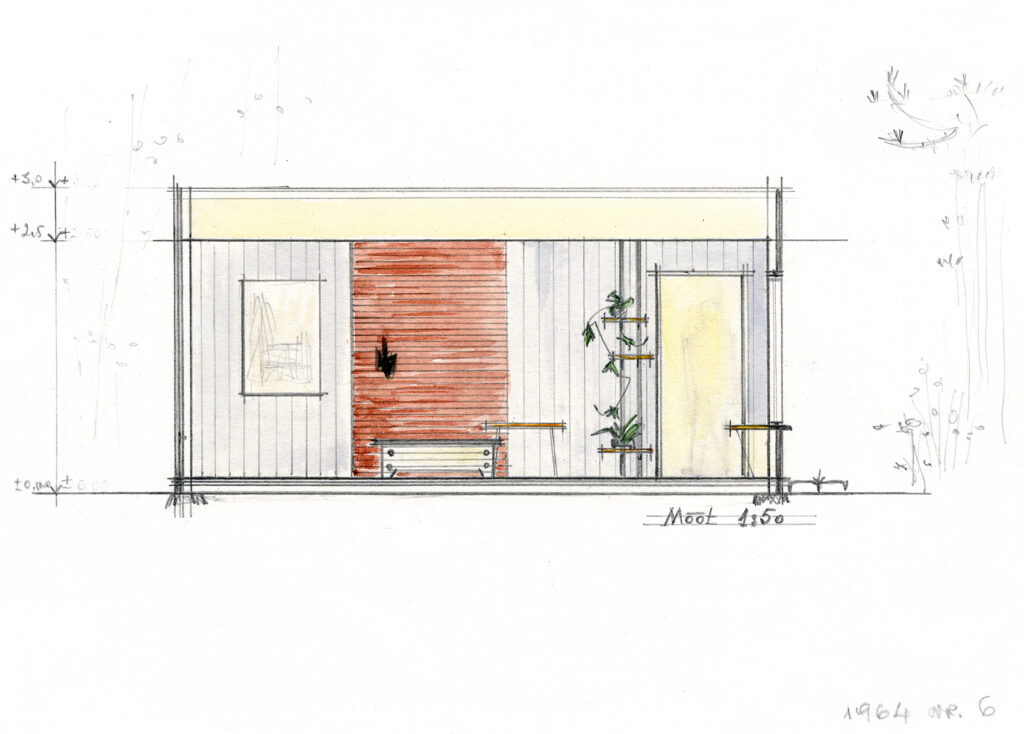
Pavilion at Nigula bog, Ethel Brafmann, 1964
-

-
Pavilion at Nigula bog
-

-
Pavilion at Nigula bog
Ethel Brafmann, 1964. EAM 35.1.105
Pavilion at Nigula bog
The pavilion is located close to the Latvian border in Pärnu County in Nigula Nature Reserve, which was established in 1957. Ethel Brafmann, a young and promising landscape architect at the time, made the design for the pavilion on the territory of the nature reserve. The purpose of the pavilion is to allow travellers to rest and prepare food while in the middle of a display dedicated to the nature reserve. The wooden pavilion is equipped with a stove and consists of a single 27 m2 room, a kitchen and a small hall with windows with shutters. The drawings originated from the collections that were donated to the museum at 2006 by Inga Tõnissar. Text: Sandra Mälk
(klick on the image to see more pictures)
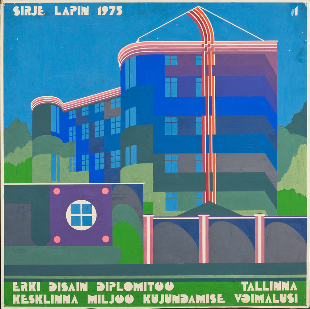
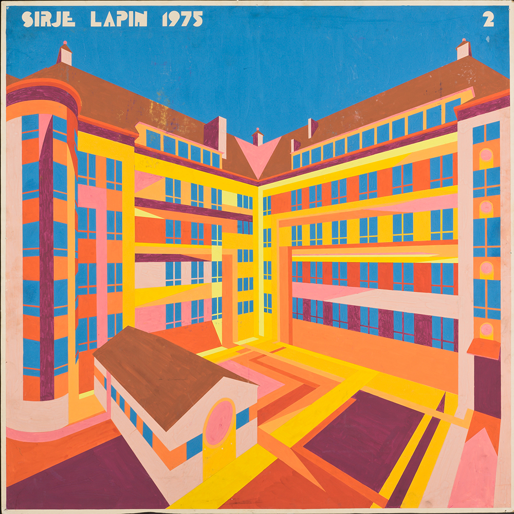
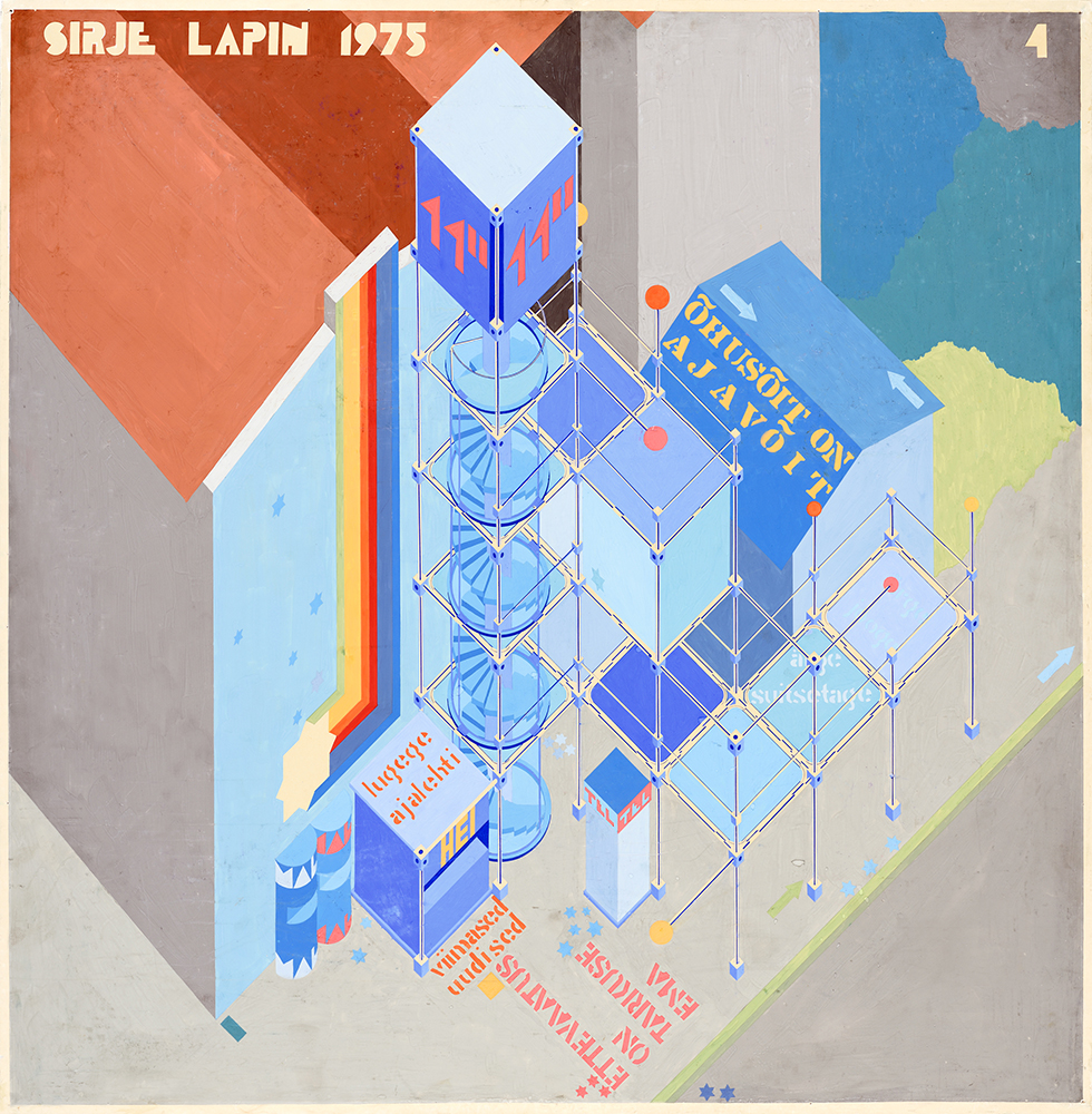
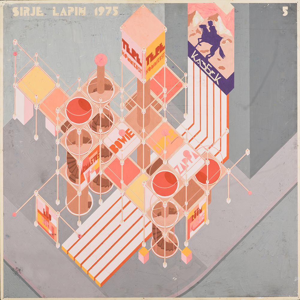
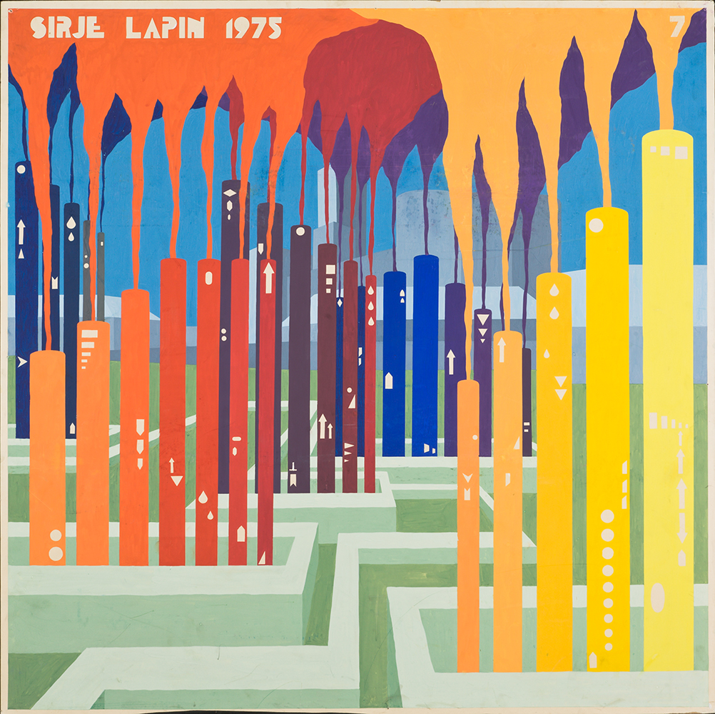
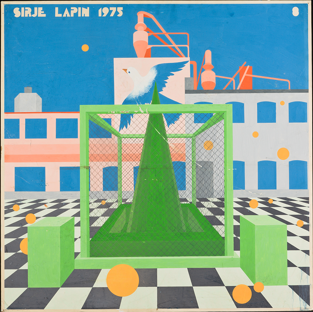
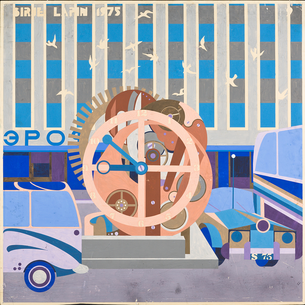
Sirje Runge, 1975. EAM 4.17.1
A new environment of Tallinn
The images show different visions for enlivening the urban space of Tallinn. Designer Sirje Runge (Lapin 1969–82) submitted this design as her diploma work at the Estonian State Art Institute. The goal was to propose new ideas to bring citizens and contemporary city closer together in an artistic manner by integrating new technical landscape forms into the urban space. Upgrading the monotonous city became an unlimited field of work for young creatives against the backdrop of the official Soviet architecture that favoured repetitive environments. In her vision, new elements were introduced to the city and the colour schemes added to the housing. The visions were of three types: the first (p. 1 and 2), supergraphics for the façades; secondly, audiovisual communication centres – the artist saw in those open and accessible spaces a new meeting places for the community and where advertisement also plays its role. The latter (p. 8 and 9) introduced conceptual objects such as steel box that governs a natural object and a clock mechanism situated at the main square in Tallinn. In that sense, such irrational objects placed in the industrial city would bring human and city closer together. Sirje Runge gave the works to the museum as a gift in 2003. Text: Sandra Mälk
-

-
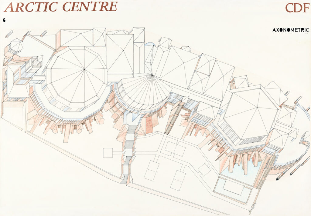
Competition entry for the Arctic Centre in Rovaniemi, 1982
Andres Alver, Leonhard Lapin, 1982. EAM.5.4.70
Competition entry for the Arctic Centre in Rovaniemi
Eight countries in the northern hemisphere, including the Soviet Union with three entries from Estonia, took part in the international architectural competition the purpose of which was to introduce Arctic nature, history and culture. The designers for the entry “CDF” drew inspiration from Caspar David Friedrich’s painting The Sea of Ice. The shape of the building, which houses two different museums – the Arctic Museum and the Provincial Museum of Lapland – bears direct resemblance to ridged ice. The idea of being dominated by Nordic nature is further emphasised by the complex being situated on the steep riverbank that follows the natural relief of the plot. Nine large-format drawings altogether with the axonometric projection shown here were brought to the museum by the authors in 2008. Text: Sandra Mälk
-

-
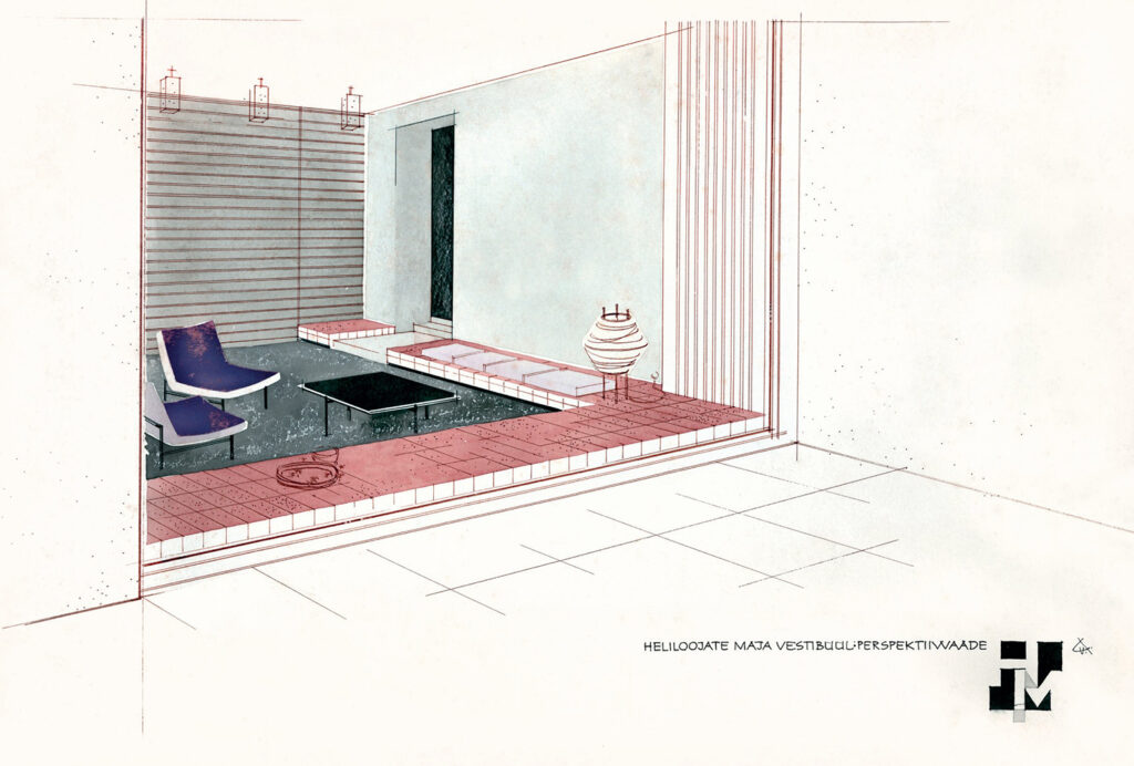
Interior design of the Composers’ house in Tallinn
Vello Asi, ca 1960–1964. EAM 4.14.4
Interior design of the Composers’ house in Tallinn
The drawing by interior designer Vello Asi depicts a view of the vestibule of the Composers’ House (architects Udo Ivask and Paul Härmson, completed 1964) located on Lauter Street in Tallinn – straight from the street through a big window. The aerial-looking interior with eye-catching low-sitting furniture is designed in the spirit of the 1960s. As was characteristic of the era, the interior designers picked up pointers from Nordic architecture literature that had just become accessible. This new approach to interior design valued open space, horizontal lines and light furniture that could be moved around with ease; it also favoured an inclusive environment to facilitate spending time in passable rooms. The drawing made with ink and watercolours was acquired by the museum in 2017. Text: Sandra Mälk


